We value your privacy
This website uses cookies to ensure you get the best experience on our website.
 Skip to main content
This website uses cookies to ensure you get the best experience on our website.
The most basic job of web design is to ensure that users can find what they’re looking for as quickly and easily as possible. This is where visual hierarchy comes in, a concept originating from 20th century Gestalt Psychology, which explains how websites can lead or direct users’ eyes via certain visual cues.
This basic principle is best described visually:

When viewing the image above, you most likely read “Your eyes here” before the sub-header “(then here)”, because at first glance, the larger font, sharper contrast, and higher positioning suggest that it’s important.
While it may seem quite straightforward, most websites fail to effectively guide users’ eyes to the most important content. As a result, users are forced to think and make sense of each page, creating unnecessary cognitive load and reducing the likelihood that users will complete the desired task.
This is why it’s so important to prioritize which content should be presented above the fold in the first place: we don’t want users to stumble into the paradox of choice (when too many choices results in inaction) because too many elements are battling for our users’ attention. Therefore we must focus on a small subset of key elements that are absolutely necessary to keep users engaged with our content.
We’ve developed a simple but effective framework for this, which we call the 3 Ws Approach: when a user lands on a new page, they should be able to immediately see what the page is about, why it matters, and where to go next. Ideally, all of these things should be noticed within 3 seconds of arriving on the page (or roughly their first 10 eye-movements). Let’s take a quick look at each of the three Ws:
 1. What is this page about?
Every page needs to quickly establish relevance in clear, simple terms. Selling car insurance? People should see the keywords “car insurance” immediately – even if your brand is well-known.
 2. Why should users care?
Once users have confirmed that the page is relevant, you need to deliver a compelling value proposition: some obvious benefits or reasons to engage further with the content on the page. In eCommerce, the “Why” is two-fold: you need to emphasize the value of the product itself, but also make it obvious why users should buy it from you instead of a competitor.
Note: A great headline can often convey both the “what” and the “why”, although this sometimes requires a clearly visible sub-header as well.
 3. Where should they go next?
After you’ve established a clear value proposition, it’s time to give them an appropriate call to action to prompt them to move forward. This could be a button, a prompt to scroll, a link, a “play” button on a video, or any other indication of what the user is supposed to do next. Whatever the next logical step is for your users, make sure that they can find it as quickly as possible.
A recent EyeQuant study of the National Retail Federation’s top 50 eCommerce sites showed that only 30% of product detail pages ensured that the 3 Ws were visible within 3 seconds. Some of the sites that did this effectively were H&M, Zalando, and ASOS.
For example, here’s a visual presentation of what users will most likely see within the first 3 seconds on an ASOS product page:
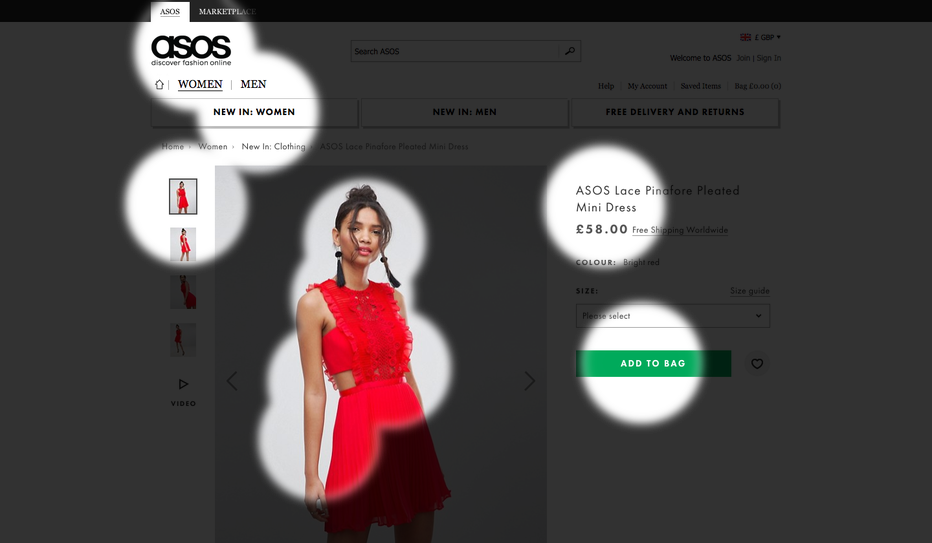
All the 3 Ws are met and the user’s eyes are directed to what matters most: the product, the product description, the price and the next step – adding the dress to the shopping bag. On the opposite end, Office Depot’s product page falls short:
.png)
This design does a good job at highlighting what this page is about: an all-in-one PC. However, both the discounted price (value) and CTA (where next) are missing, two key components to drive potential customers further down the funnel.
Countless case studies have shown that visually emphasizing the most important content can significantly increase conversion rates. One of the most striking examples is the case study below from Groupon. Here’s how users were scanning the page when Groupon initially tested their design:
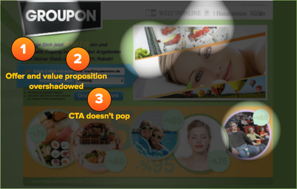
As you can see, there were obvious flaws in the visual hierarchy. Instead of emphasizing the 3 Ws, users were likely to get distracted by the surrounding imagery. Groupon used this insight to re-design the page, and the results were fantastic. Here’s how people looked at the page after the redesign:
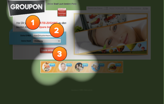
Suddenly, users were laser-focused on the content that actually matters. The result? A 52% increase in sign-ups.
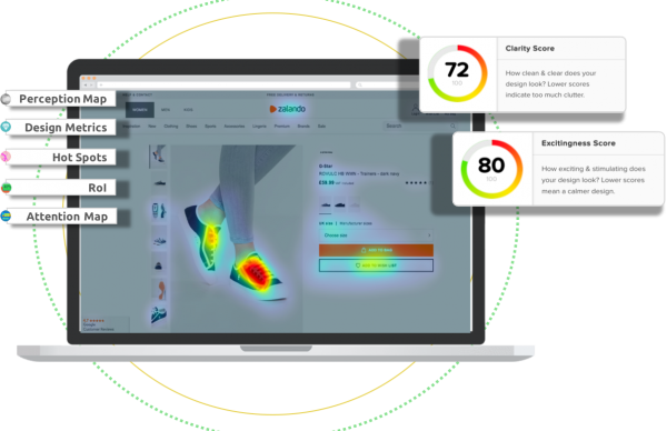
The easiest way to measure this is using EyeQuant’s Perception Map feature, but to find out how to actually influence attention, see our video tutorial: 3 Ways to Influence Attention (YouTube, 9 minutes).
Check out our latest top tips on how you can use EyeQuant to spy on your competitors, analyse mobile...
Read more
In our latest blog we explore how to use neuroscience to help create higher performing digital products.
Read more
Figma is the go-to prototyping platform for many UX and web designers – and not without reason. Its functionality,...
Read more