We value your privacy
This website uses cookies to ensure you get the best experience on our website.
 Skip to main content
This website uses cookies to ensure you get the best experience on our website.


Big Contacts – a web-based CRM targeting small and mid-range businesses – are smiling, and no, it’s not just because Spring has finally arrived.
Digital agency Surge Labs published a case study last November showing how they achieved a 56% conversion boost in sign-ups on Big Contacts’ landing page. Especially in a competitive field like CRM, this uplift represents a significant achievement. Here at EyeQuant, we always love a good success story, so we thought we would analyze this one through our own lens.
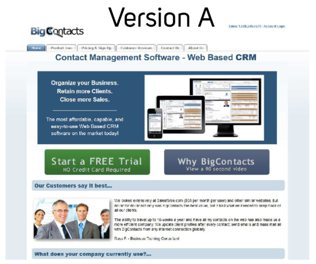
Here is Version A of Big Contacts’ website. For all intents and purposes, it’s probably not the worst web page you’ve ever seen, which is precisely why it becomes much more fun to analyze.
Surge Labs hypothesized that, in order to better capture potential customers’ attention in such a competitive field, Big Contacts would need to eliminate clutter and focus on one key design strategy: Clarity.
They would achieve this by:
Now take a look at the perception maps of the EyeQuant analysis of Version A below:
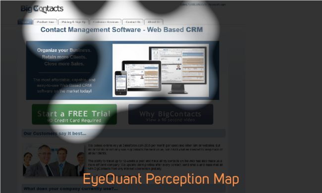
The value proposition is clearly the element on the page that needs the most work; we can see what the software looks like, but we aren’t immediately aware of the core benefits it offers us. More importantly, perhaps Big Contacts’ greatest benefit – its affordable plans starting at $15 per month – isn’t even on the page.
Version B of Big Contacts’ landing page corrects these problems beautifully.
Let’s take a look why:
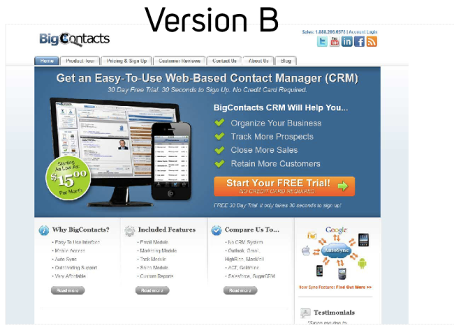
Big Contacts’ value propositions are now clearly lined up in vertical bullet-point form, ending with a big orange CTA button. The improvements to the user’s navigational path are clear, and can once again be immediately gauged using EyeQuant’s perception map:
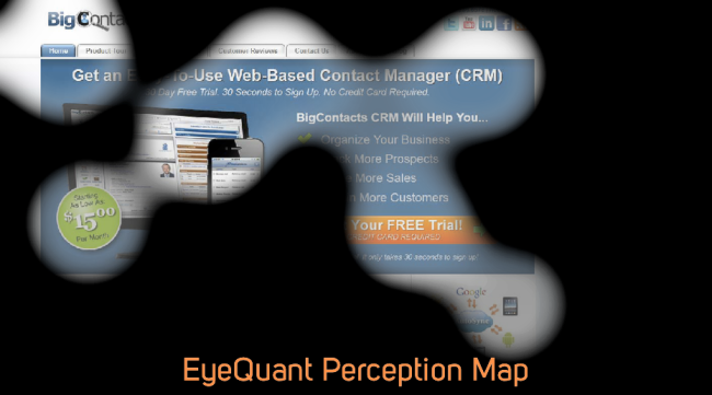
Now, isn’t that a thing of beauty?
Not only are the four bullet pointsimmediately visible as the user’s gaze makes its way from the headline to the CTA, but the navigational path also calmly makes stops at an image of the softwareand an attractive price tag.
The best part? The logo, the headline, the core benefits, the price, and the CTA, are now visible within the first few seconds of a user’s visit to this landing page. Even visual information about the company’s social media presence and its syncing abilities are visible. Impressive.
Surge Labs made an excellent use of colour in Version B of this landing page by choosing consistent three colours to draw attention to urgent information:
These three colours are set off brilliantly by a cool blue background in which all the most important “above the fold” information is situated.
Most importantly, the use of colour choices is consistent and logical. While in Version A the user had to decipher between two text colours (blue and white), Version B’s text is all white, removing the need for the user to process any unnecessary aesthetic changes. The same could be said for the flashes of green next to the core benefits: by establishing bright green as a color associated with core benefits, the user is able to make instant connections between the price all the way on the far left, and the bulleted core benefits in the mid right.
While too much variation in colour can be distracting to a user’s initial attention, here it has been well implemented. In Version A, a user had to leave the comfortable blue box and choose between one of two CTA’s, creating a visual barrier between the description of the product and its call-to-action.
In Version B, the user’s focus can remain almost entirely in the blue box – it immediately indicates that the user is in a zone that contains important information.
In previous EyeQuant blogs, we’ve discussed the importance of clarity in creating a visually calm, easy-to-navigate landing page. Digital Surge’s work with Big Contacts is an excellent testament to this strategy. Bravo!


We look at how to leverage predictive eye tracking to improve your Black Friday marketing campaigns.
Read more
In this article, we’ll discuss our data-driven approach to CRO, including fundamental tools and principles that will help to...
Read more
Great SEO brings users to your site. A great UX helps them achieve their goals after they arrive. Too...
Read more