We value your privacy
This website uses cookies to ensure you get the best experience on our website.
 Skip to main content
This website uses cookies to ensure you get the best experience on our website.
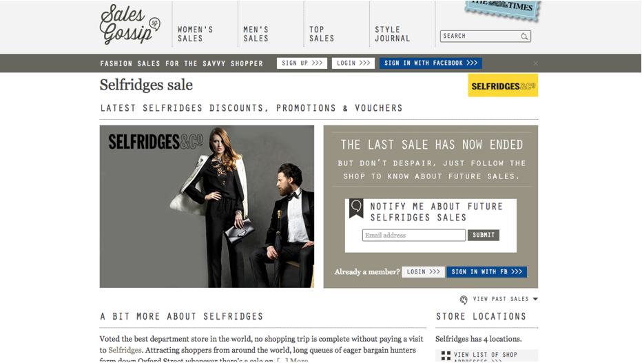
SalesGossip directs savvy deal-hunters to the latest sales and promotions of their favourite brands. Users sign-up to access the details of each sale event, and opt-in to receiving emails to be notified about future deals.
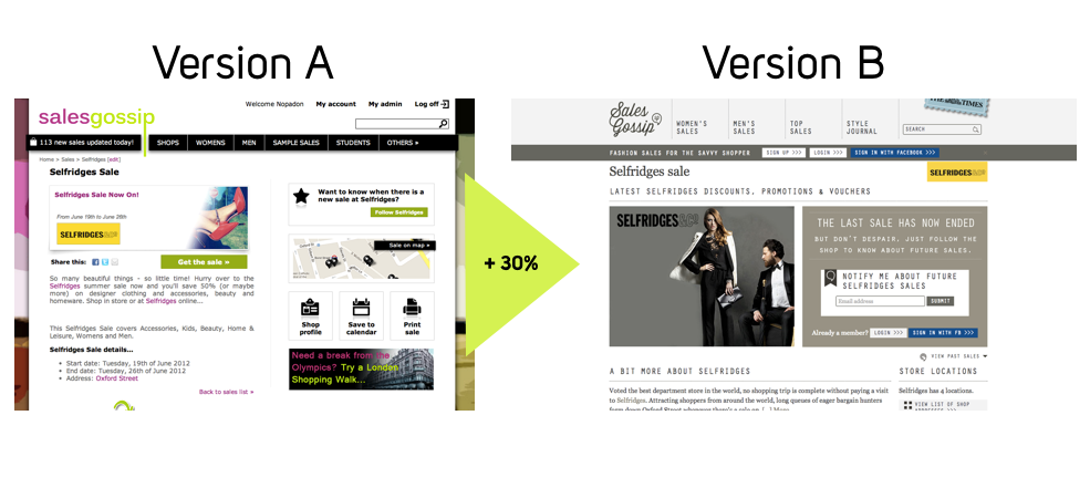
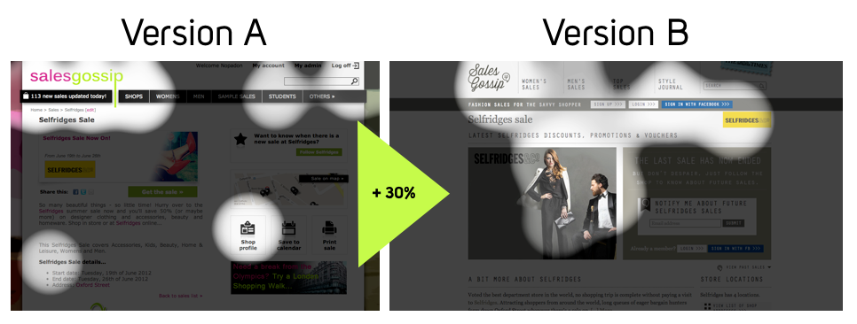
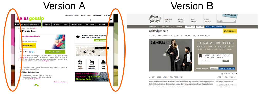
SalesGossip recently overhauled their entire website using EyeQuant to test and compare changes along the way, and in doing so achieved an instant 30% boost in sign-ups. Not only this, but SalesGossip made some excellent fundamental changes to their core branding and content, putting them in line with the look and feel of other fashion websites in their ecosystem.
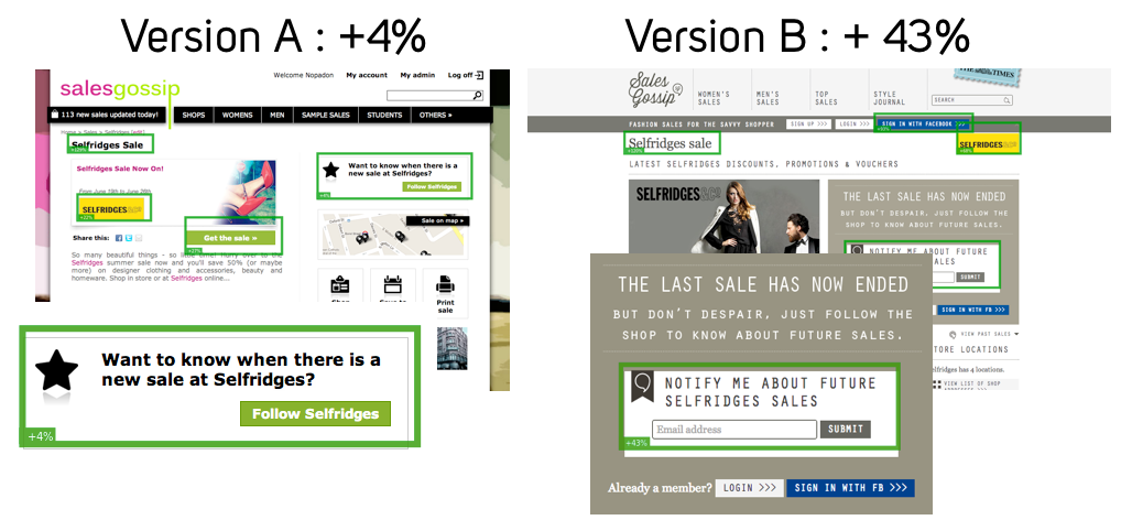
EyeQuant’s “Regions-of-Interest” function lets us measure how attention-grabbing a specific region of a page is in comparison to the average pixel on the page. Here, we can see that the “notify me about future sales” call-to-action went from 4% to 43%more attention-grabbing than the average pixel on the page. Why?
Even though Version A’s “Follow Selfridges” button is colorful and flanked by starred, bold black text, the button isn’t placed in a prominent location, and its light green color doesn’t produce enough contrast against its white background. In Version B, the user’s eye is drawn toward the “notify me about…” region thanks to the grey box that surrounds it, as well as its far more central location.
Version A doesn’t give the user much of an idea of what they might expect from Selfridge’s; they simply see a logo and a pair of shoes that don’t necessarily conform to the brand’s identity. In Version B, an ad campaign image from Selfridge’s takes centre stage. In this way, the user can instantly gauge the feel of the brand while being directed through a navigational path that is consistent with the overall aesthetic of the page.
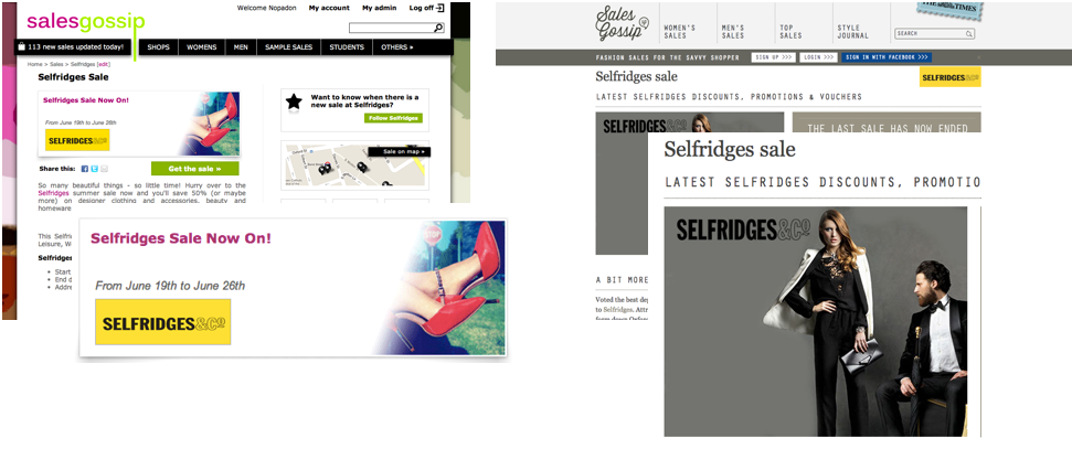
30% of Facebook’s 500 million + users use Facebook Connect to log in to third party sites every month. SalesGossip used this knowledge to make their Facebook Connect CTA stand out with a blue button against an otherwise grayscale, monochrome scheme.
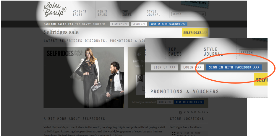
Nobody will deny that the marriage of e-commerce and fashion editorial has become a strong one. Bloggers sit in the front row of fashion week, while Harvard Business School offers a course on just this subject. SalesGossip placed their “style journal” – a fashion editorial guide for their users – in a prominent position on the page in order to engage potential users and make them feel part of a fashion community.
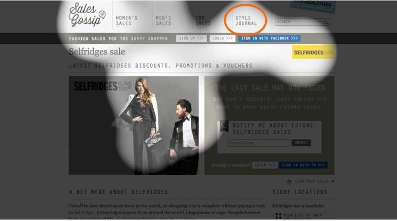
Recent studies into the science of human attention show that, rather unsurprisingly, it’s more difficult for us to find things in a messy environment. Scientists at MIT were able to hone in on one point in particular, though: too much variation in size, color, and texture is confusing. Even though Version A provided all the information a user might need, its organization was inconsistent, with too many varying sizes and colors scattered across the page. Version B’s flow becomes clear using EyeQuant’s Perception Map, where spotlighted areas show what users will see in the first 3 seconds. As opposed to Version A, where the user’s eye is jumping all over the page, Version B provides a focused path, putting the user at ease.
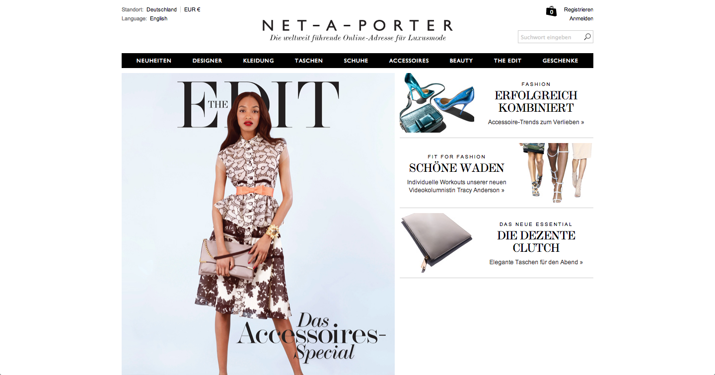
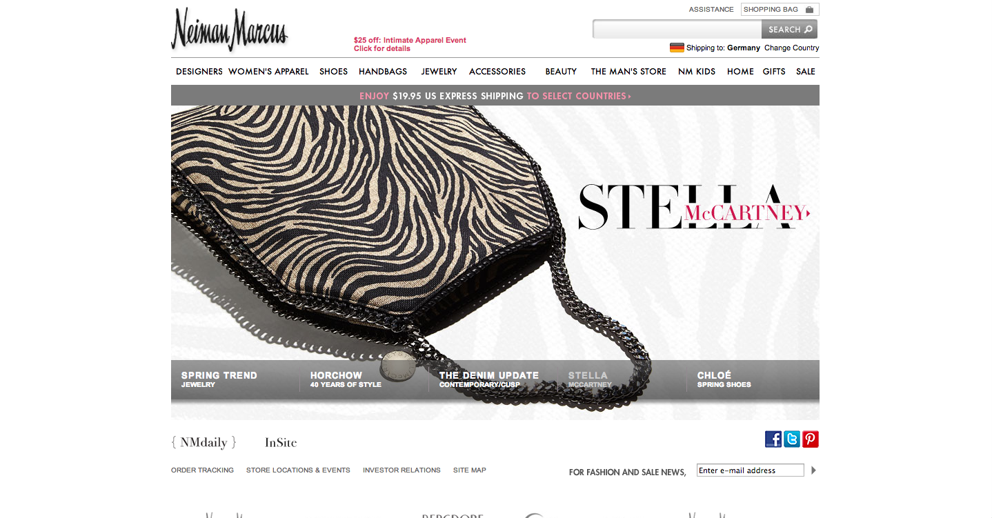
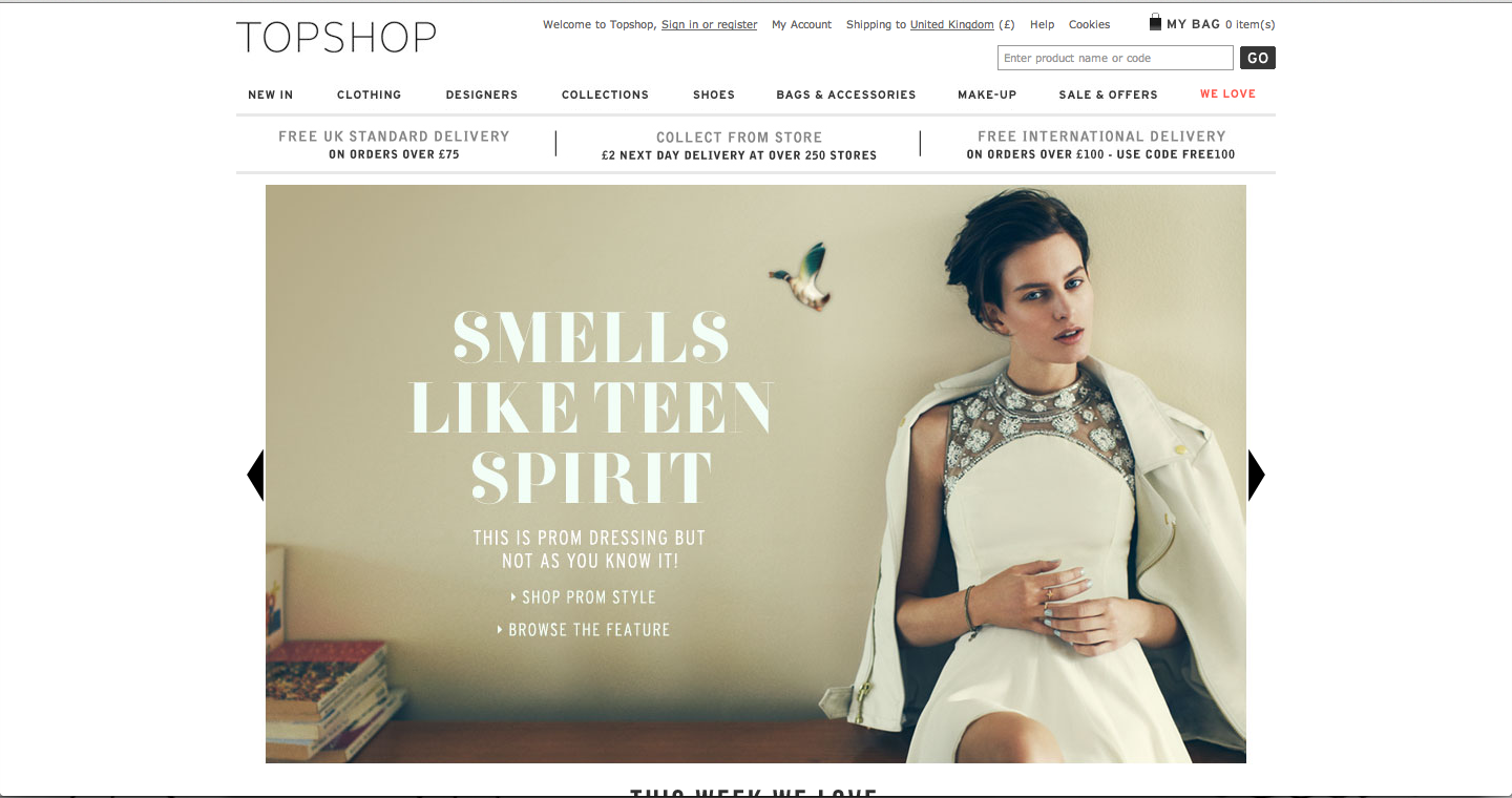
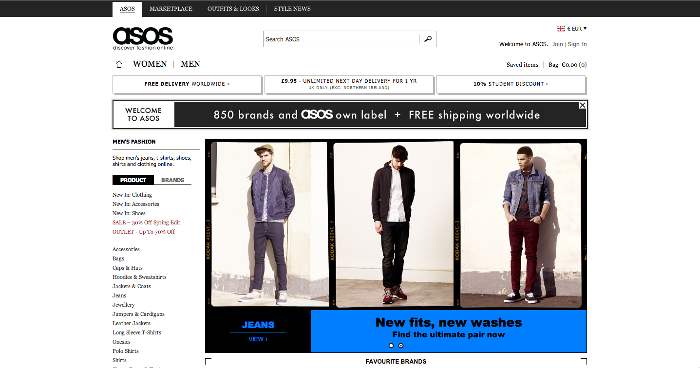
Coco Chanel made black and white a chic staple in fashion in the 1920’s, and this trend continues today. Sites like Net-A-Porter, Neiman Marcus, ASOS, and TopShop adhere to a monochromatic black & white color scheme to impress a sense of sartorial savvy upon their users. By following their lead, SalesGossip effectively aligns themselves with the online fashion eco-system, allowing potential and current users to more immediately identify the site’s relevance in its field.
In Version A, two banners of color flanked either end of the page, drawing the eye to the outer edges of the page; in Version B, this colorful background is replaced by white, centralizing the user’s focus and calming the visual path. Creating white space around important elements eases and smoothes the process of user attention, quite simply reducing the amount of information competing for user attention.
Want to find out how users are seeing your website during the first moments of their visit? Request a personal demo with one of our experts and we’ll show you a free analysis of your website.

We look at how to leverage predictive eye tracking to improve your Black Friday marketing campaigns.
Read more
In this article, we’ll discuss our data-driven approach to CRO, including fundamental tools and principles that will help to...
Read more
Great SEO brings users to your site. A great UX helps them achieve their goals after they arrive. Too...
Read more