We value your privacy
This website uses cookies to ensure you get the best experience on our website.
 Skip to main content
This website uses cookies to ensure you get the best experience on our website.
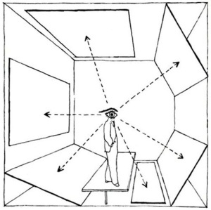
Information isn’t picky: Anyone, anything, or anybody can be a part of it anytime, anywhere, and by any means possible. Attention on the other hand, is finite; we only have so much of it, and in these information-overloaded days, we have to be careful how – and where – we deploy it. In online marketing, a web page only has between 3 and 5 seconds to successfully communicate its intentions – and capture attention – before a user will leave the page or explore further.
This is why EyeQuant is focussing on something we like to call attention-driven design. Simply put, we help designers to build web pages that focus on where and how users are directing their most valuable commodity: Attention.
Understanding User Attention
Designing for user attention can be broken down into a few key categories:
1) Making the 3W’s Visible – Within the first second of arriving on a landing page, does the user understand what the page is about, why they are there, and where they should go next?
The 3W’s form a basic structure of what information your landing page should hold:
When the 3W’s are effectively in place so that a user sees them immediately upon arrival, a user will feel as if they are being communicated to directly, honestly, and efficiently – leading to improved click-through and conversion rates.
2) Focus & Flow – Is the visual path that the user’s eyes take through the web page fluid and coherent? An essential part of designing for attention is to understand that a user will feel more at ease on a landing page or website when their eyes aren’t bouncing from one location to another.
3) Brand Recognition – Is your branding straightforward and recognizable, but not distracting from your offer? Brand awareness – conveyed through a unique use of color, typography, logos, and even mascots – makes a company recognizable and trustworthy, and it is important that this identity is holistically present on a web page. In online marketing and sales, a user’s gaze must be aware of branding from their first moments of arriving on a landing page. If the 3W’s are the door, the chair, and the table in a room, a company’s brand identity should be the paint and the pictures on the wall, defining the atmosphere but never distracting from the contents of the room.
Attention-driven design isn’t just about designing for the first few seconds of contact with a user. The real success of a landing page lies in its ability to maintain and guide a user’s attention in an engaging, even surprising manner from start to CTA. After all, designing for attention isn’t merely a matter of pushing out as much content as quickly as possible, it is about finding ways to stimulate user experience by offering interactive and understandable visual pathways.
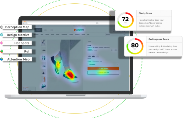
You can test your landing page’s attention aptitude with EyeQuant at our website.
Image credit: Herbert Bayer, Diagram of extended vision in exhibition presentation, 1930

Check out our latest top tips on how you can use EyeQuant to spy on your competitors, analyse mobile...
Read more
In our latest blog we explore how to use neuroscience to help create higher performing digital products.
Read more
Figma is the go-to prototyping platform for many UX and web designers – and not without reason. Its functionality,...
Read more