We value your privacy
This website uses cookies to ensure you get the best experience on our website.
 Skip to main content
This website uses cookies to ensure you get the best experience on our website.
With a growing number of conversion testing tools appearing on the market, it’s no surprise that nearly every agency and business experiments with their landing page, email, banner and advert designs. Especially when you consider that user testing is often lauded as the miracle behind improving conversion rates.
Marketing departments and agencies everywhere spend huge amounts of time scrutinising every single part of a design, testing it in tiny increments. And you might see the desired improvements. You might use heatmapping tools like Hotjar, Clicktial and Crazy Egg or technology like Tobii Eye Tracker and succeed in conversion rate optimisation. You might undertake user testing and highlight areas to improve. But despite all the effort and resource you put into this, you reach a limit. You reach the local maximum in your conversion rates.

Local maximum is when you hit the peak of your current design. Regardless of how many tweaks you make, you can’t improve the overall design. You’ve made the site, banner or email as effective as it’s going to get.
By relying on user testing only once a design is live, you effectively put a limit on how successful your marketing or website can be.
The Germans have a fantastic word: verschlimmbesserung. It’s a common expression to describe attempted improvements that make things worse than they already were. And it’s perfect for highlighting the problems with user testing and local maximums. You can pour masses of time and resource into testing your live designs, tweaking and changing isolated elements for slightly higher conversion rates. But overall, because you’re testing a live design, you can’t make the big changes that could have big results.
Plus, updating these single elements often has a detrimental effect on the overall design. When you stop considering the asset as a whole, and instead change individual parts, you risk it turning into a Frankenstein’s monster of bodged-together sections and disparate themes.
User testing a live design is at best pointless and at worst, potentially damaging. So, start using predictive testing. You avoid hitting the local maximum ceiling and instead you can create designs that will have a huge impact on your conversion rates.
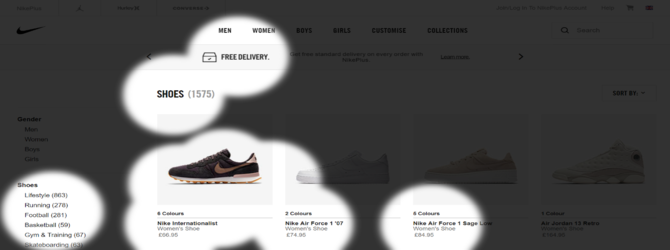
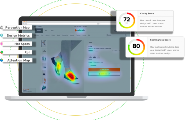
This is what inspired our testing processes and tools. While heatmaps and A/B testing show you how a design is performing, they don’t give you any insight into the quality of your original design. To build on this and inform optimal design you need predictive data and testing. In the past, this has always been expensive, complicated and time-consuming, therefore ruling it out for many marketing departments. So, we created tools that give people a fast and simple way to see areas of attraction, visual hierarchies, design clarity and emotion engagement on any design.
If you combine predictive testing with user testing, you make your results far more efficient. In our experience, our clients see the best results when they use our testing in line with tools like Hotjar.
When marketers use predictive testing – including eye tracking – you can reach optimal design faster and get more value from other user testing tools and processes
Predictive testing lets you avoid verschlimmbesserung and actively create a design that’s more likely to improve your conversion rates.


Check out our latest top tips on how you can use EyeQuant to spy on your competitors, analyse mobile...
Read more
In our latest blog we explore how to use neuroscience to help create higher performing digital products.
Read more
Figma is the go-to prototyping platform for many UX and web designers – and not without reason. Its functionality,...
Read more