We value your privacy
This website uses cookies to ensure you get the best experience on our website.
 Skip to main content
This website uses cookies to ensure you get the best experience on our website.
The 4th of July is nearly upon us, and US retailers are scrambling to promote their holiday sales. One of these retailers is Lowe’s, and today we’re going to critique the popular hardware chain’s current (June 28, 2017) homepage design as part of our new series of Data Driven Design Critiques.
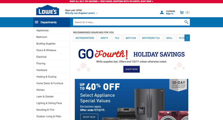
Please note that we don’t have any access to Lowe’s website analytics, but we do have EyeQuant, an AI for design analysis that’s been trained (via machine learning) with a large database of past user research data, so we’ll be able to objectively rate and benchmark Lowe’s design. Using this software, we found two interesting areas for improvement on this page:
The most important thing for Lowe’s today is to promote the 4th of July sale. We used EyeQuant’s initial visual attention analysis to see which content is the most eye-catching (shown in red), and which content gets lost.
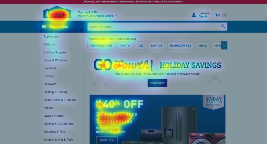
Unfortunately, the elements that attract the most attention are the brand logo and the banner at the bottom of the screen, which will only be relevant for a sub-set of users because it’s specifically about appliances. This could send mixed signals and not lead the users’ eyes to where Lowe’s wants them to go.
As with any eCommerce site, it’s important for Lowe’s to provide a clean, clear landing point for potential customers.
In order to gauge whether or not Lowe’s has accomplished this, we analyzed the page with EyeQuant’s Visual Clarity algorithm, which rates the design on a scale from 0 (extremely cluttered) to 100 (extremely clear). The results are representative of a 200-user survey, where every participant rates the design in terms of clarity.
Lowe’s homepage scored a 57, which is above the average score for the Alexa 5000, but lags slightly behind Home Depot (59), and many of the other top retailers. For example, the National Retail Federation’s top 50 eCommerce sites have an average clarity score of 64. It’s clear that Lowe’s could do a bit better in this regard.
Here’s a quick presentation of which areas are contributing most to a sense of clutter:
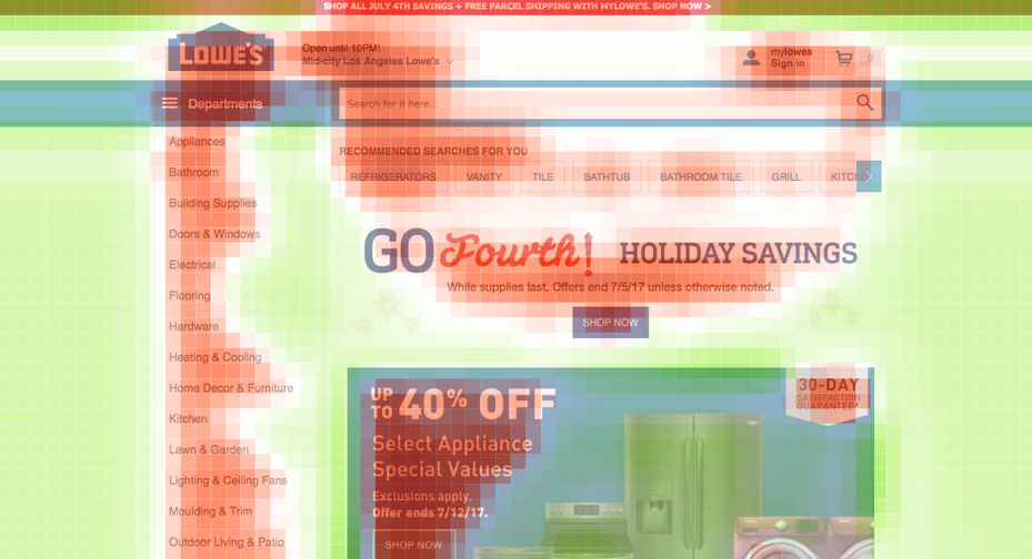
The easiest way to fix this is to just simply remove content that isn’t absolutely necessary (prioritization is key here). This allows you to direct attention more easily (since less elements means less competition for attention) and reduce cognitive load for the user (the mental effort required to perform a given action).
Although the Lowe’s design has some room for improvement it doesn’t need a complete overhaul. Here are some examples of a few straightforward tweaks that might be worth testing:
Here’s a quick example of what the page could look like:
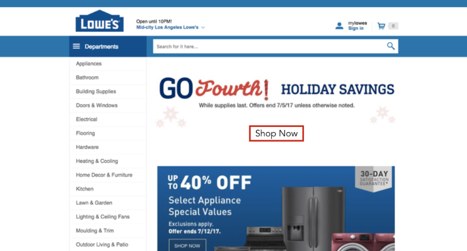
It’s not radically different, but a quick EyeQuant analysis shows that it might be more effective. Here’s the attention map:
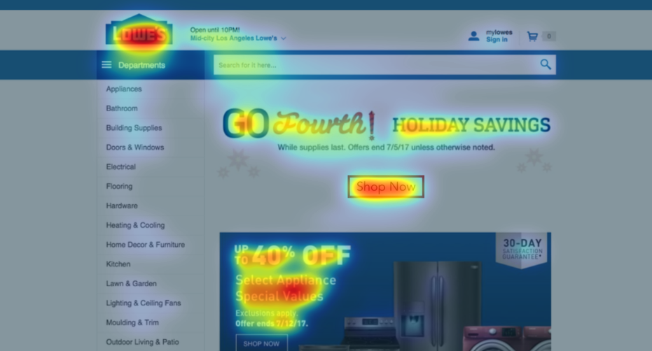
These changes drive more attention towards the main CTA, and lead to a 35% higher clarity score (77). This gives the site a well-defined visual hierarchy and makes it crystal clear that the holiday promotion is the main offer on this page.
