We value your privacy
This website uses cookies to ensure you get the best experience on our website.
 Skip to main content
This website uses cookies to ensure you get the best experience on our website.

At Media Evolution’s The Conference last week in Malmo, EyeQuant’s co-founder Fabian Stelzer spoke about the war between data and creativity that so many of us feel in the marketing world, and offered a few concrete tools to make peace between these two perennially opposing sides.
Most of the way through the talk, he made mention of a simple yet universal way of bridging the conversion optimization language gap:
Show your process.
As opposed to an analytics expert slamming a 42 page market report on the conference table, or as opposed to a designer shrugging their shoulders and saying, “just trust me, I’m a creative”, showing how you’ve worked through a problem is crucial to finding understanding between teams. In this way, a universal, visual language is formed.
In this post, we’ll take a look at 5 key ways to visually explain your process, find common ground between different departments, and work through your web optimization process more efficiently.
Here we go…
Back in 1979, Joël de Rosnay began speaking about a crazy idea called the “macroscope”. If microscopes are for observing the infinitely small and telescopes are for observing the infinitely great, thought de Rosnay, then what kind of instrument could we use to observe the infinitely complex? For de Rosnay, this was the macroscope: a global, holistic view of the world around us – one that finds connections through infinite detail.
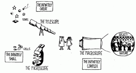
With a global view of a problem (like a bird’s eye view from space), wouldn’t we then be able to see the best paths to take to solve our problems?
This, of course, is the rhetoric that has played through the minds of everyone who’s ever uttered the words, “big data”: in a complex world, we need tools to help us cut through the brush and see the light at the end of the problem: not just numbers, but connections.
We often forget to take into account a macroscopic view of the various problems that arise when it comes to web optimization. As a result, we get caught up in details, start fidgeting with pixels, and forgetting that, by zooming out of the minutiae, there’s always a big picture.
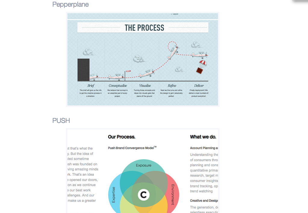
Chris Spooner made this great list for Line25 about design agency websites that do a good job of visually describing their research and design process. His examples vary from venn diagrams to squiggles, but the end result is clear: visual descriptions of complex strategy provide a mental image of a problem and its solution, putting everyone at ease by graphically describing what a process entails, why a certain part of the process is important, and most importantly, and by giving a macroscopic view of what the designer will do to solve their client’s problems.
Bonus: a global mental picture of your research and design process can help to justify aspects of your budget that might otherwise get cut out.
When we first set out to create EyeQuant in 2009, we had a hunch that our potential customers – e-commerce companies and digital agencies – were feeling the tension between data-driven and creative design.
Designers already had the experience to know what might work, but increasingly we found that they would need to back up their findings with data – in a way that everyone (including themselves) would understand. After all, marketing and advertising play in a far bigger playground these days, and intuition alone doesn’t cut it.
Crucial to ending the war between data and creativity is learning how to blend the two together. What we needed are tools and strategies to visualize data, and vice versa: accurate, intuitive, yet complex enough tools to grip the big picture – and all the little ones that surround it.
In the world of data visualization, Moritz Stefaner, who works with everyone from FIFA to Skype, is one of the great minds. In this lecture, Moritz makes an astounding point about marrying information with design – and leaves clues to everyone from growth hackers to designers on how to work with and show data and process:
“good visualizations show you the data, great visualizations show you the patterns of the data . . . good visualizations answer questions, but great visualization generate new questions . . . good visualizations tell a story, but great visualizations tell a thousand stories”.

There is a persistent misconception outside the design world that creatives tend to pull ideas out of thin air a couple minutes before a presentation. The reality couldn’t be further from the truth, but if this isn’t shown, then nobody will be the wiser. From an initial sketch on a napkin to a full deconstruction and reconstruction of a competitor’s web page, showing visual examples of each iteration of your design process provides transparency, and proves that you’re thoroughly working through problems.
A fantastic resource for keeping track and sharing each step of your design is LayerVault. LayerVault is a beautifully designed software that saves and catalogues every single revision you make, and let’s you decide which iterations to show to colleagues. What makes this app really special is the ability to return to a step you’d written off a day ago that, the next day, turns out to be the solution (without pressing command_z a thousand times).

We know, we know, there is a certain level of ego that needs to be upheld during design meetings in order to maintain a modicum of authority. As the old saying goes, though, “the truest characters of ignorance are vanity and pride and arrogance.” Speaking about your mistakes (and better yet, showing them) promotes an environment of empathy, of teamwork, and of humility. We’re all human, we all make mistakes, so let’s ‘fess up to them and learn from them.
Of course, making informed iterations during the design process can be difficult; testing a re-design or a new web page pre-launch is next to impossible, and going on market or design research alone leads to many unknowns.

Showing your iterations, showing how you tested them, and then showing what went right and what went wrong is a sure-fire way to impress upon your boss, your team, and your clients that you know what you’re doing. Laying out a clear roadmap not only instills trust in the others at the meeting, it also lets designers work with far more daring ideas. Just look at Google.
Better yet, it works both ways:
During his talk at The Conference, Fabian suggested that we need tools that provide “creative data” – tools that are fast, communicative, objective, and not all too final. This last point is crucial: both creative and growth hackers need to come to terms with the limits of their own domain, and this is where they can come together.

We look at how to leverage predictive eye tracking to improve your Black Friday marketing campaigns.
Read more
In this article, we’ll discuss our data-driven approach to CRO, including fundamental tools and principles that will help to...
Read more
Great SEO brings users to your site. A great UX helps them achieve their goals after they arrive. Too...
Read more