We value your privacy
This website uses cookies to ensure you get the best experience on our website.
 Skip to main content
This website uses cookies to ensure you get the best experience on our website.
I’m a Bruce Springsteen fanatic. As in fly to another continent to watch him perform live, queue for a day to be in the front row. A few days ago, Facebook hit me with an ad for a Springsteen T-shirt. I clicked more or less instinctively. Below is a screen shot of the landing page that greeted me, overlaying EyeQuant’s perception map. It highlights what is most likely to be seen first after arriving on the page:
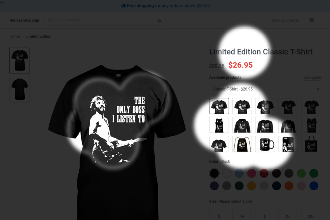
Three areas pop: the product image, price, and a grid of images that turns out to be a product type selector.
This third area is where I felt myself losing momentum. Highly motivated, credit card ready. And yet, temporarily stuck at this thumbnail grid. I came for the Tee, but should I rather go for long sleeves? Hey, there’s a mug…
Trapped in AIDA as it were. In case you’ve never heard of it, AIDA is an acronym for Awareness – Interest – Desire – Action, the steps consumers go through when they buy something. In this case, Desire was on fire, but Action was delayed.
Interrupting progress from Interest to Desire to Action ultimately gets in the way of the sale, according to Dr. David Lewis, author of Brain Sell. The Product Detail Page (PDP) is where much of this progression happens. It’s a common mistake to focus on UI at the expense of the sales conversation that plays out in the mind of the user. Below are three principles to consider.
It sounds obvious: make it easy for someone to transact on your site. Actually, the site in the story above does a reasonable job. EyeQuant assigns a Clarity Score of 76 – a metric based on visual clarity data.
Unexpected things get in the way of the purchase decision. Here, it was the product selector grid, supposedly an element ironically aimed at improving the user experience.
Only about 5% of our buying decisions are made in the conscious mind. The vast majority are made on autopilot. In fact, when conscious thinking takes over, we become less likely to buy. This is what happened when the page got me thinking about product choice. Removing that one step could help to maintain momentum and get me to the Action stage, without stopping to think about it.
Over ten years, AWA’s team of consultants have spent hundreds of hours observing users navigating PDP’s on e-commerce sites around the world. Consistently, we see images act as the driving force advancing online buyers through the AIDA steps.
Photographs do more than simply show what the product looks like. They act as a virtual shop assistant. Users routinely study them to find answers to specific questions. How thick is this rug? Are these shoes made of leather? How does the dress fall? What about the brake system on this buggy? Because images are processed faster than text, it’s a good way to keep the conscious mind from disrupting progression.
Interestingly, images tend to have more authority than text. For example, if the product description states batteries are excluded, but batteries are shown in an image, that is easily taken as a sign that the copy is incorrect.
Up to a point, pictures do all the selling. Once a user starts engaging with product copy, it usually signals a move to Interest or Desire.
However, reading product copy could easily shift things from the realm of the subconscious to the conscious. Rational thinking gets involved, and the sale is delayed or lost. Messages dominated by prices, discounts and features can tip the balance in the wrong direction.
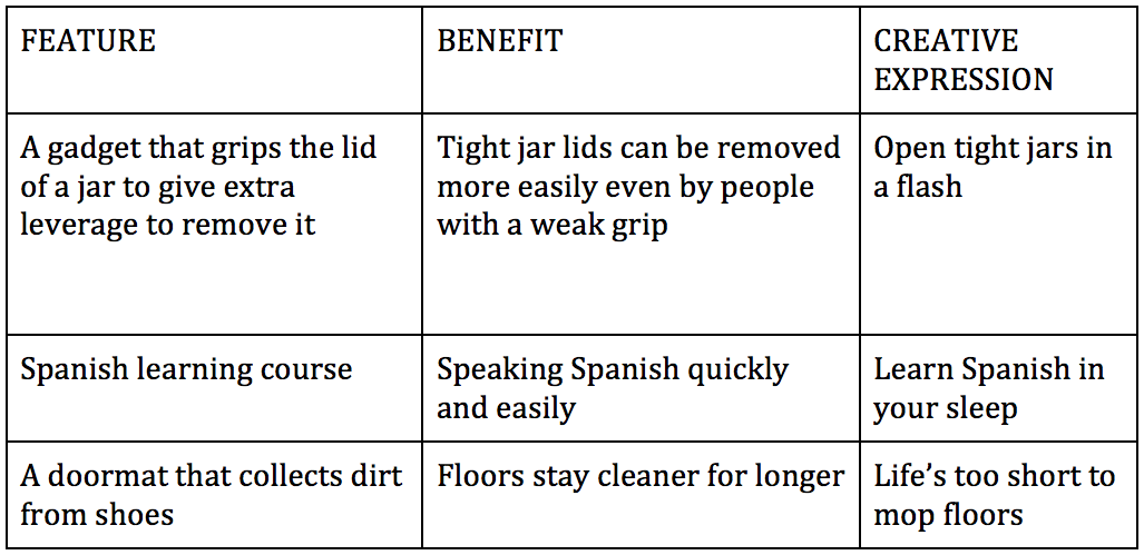
Content that appeals to the subconscious therefore tends to be more effective. For this reason, master copywriters present benefits rather than features. Features are what a product is or does, benefits are what it does for the user. Features describe what you are selling, benefits are what the user is really buying.
There is also a difference between the benefit per se and how it is dramatised creatively. Below are three examples to illustrate this.
—
Want to learn more about how to design an effective product detail page? Check out our design tips here.


We look at how to leverage predictive eye tracking to improve your Black Friday marketing campaigns.
Read more
In this article, we’ll discuss our data-driven approach to CRO, including fundamental tools and principles that will help to...
Read more
Great SEO brings users to your site. A great UX helps them achieve their goals after they arrive. Too...
Read more