We value your privacy
This website uses cookies to ensure you get the best experience on our website.
 Skip to main content
This website uses cookies to ensure you get the best experience on our website.
When consumers are busy, under time pressure or slightly indifferent towards a product’s branding they tend to choose products that visually pop out, even overriding their personal preferences.
As the old adage goes, “seeing is believing”. 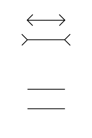 World-famous behavioural economist Daniel Kahneman specified the principle as “What You See Is All There Is”, pointing out how most of our decisions are based on quick, intuitive and ultimately flawed perceptual processes. A simple example of this is the universally flabberghasting Müller-Lyer illusion, in which two lines of equal length appear to differ once outwards and inwards arrows are added.
Of course you KNOW that the lines are of the same length, yet you can’t “unsee” the presumed difference. Measuring it would certainly help, but our perceptual apparatus has a tendency to laziness. We’re a notoriously visual species – what you see is all there is.
Now, two of the vision researchers behind EyeQuant’s technology just published a study together with their colleagues in the Journal of Consumer Psychology that goes a little further: simply put “seeing is buying” – or: what you see is what you buy.
The study’s experiment, conducted by Caltech researchers and EyeQuant Advisory Board members Professor Mili Milosavljevic and Professor Christof Koch and their colleagues, is fairly straightforward: The scientists presented 7 hungry subjects with 15 food items, such as candy bars and chips of different brands. Subjects were first asked to rank those items in order of their preferences – e. g. some love a certain brand of chips, but hate Snickers, all whilst also having a slight preference for a brand of coconut candies, etc. etc. The subjects then had to make multiple rounds of choices between any two of those items – a little bit like you would when rushing through a supermarket.
This could be as simple as the most preferred item vs. the least preferred one, but obviously could also involve a choice between products that were ranked to be of similar attraction. To emulate a more crowded, supermarketish environment, the researchers surrounded each of the displayed products with 8 other items.
Now, if you’d assume that people stick by their preferences, you’d be absolutely right.
After all, companies spend billions of dollars on marketing to establish those preferences in the first place. Unsurprisingly, the researchers found that the simple choices were pretty much completely in line with the initial ranking given by the participants.
If someone indicated that they preferred snack A over snack B, they’d also choose accordingly.
Unless those preferences are overridden by a simple design tweak.
Milosavljevic and Koch found that they could significantly affect the choices of participants by altering the brightness of an item, which causes it to visually stick out a bit more. That’s right: improving the visual “pop-out effect” of a product (or demoting the pop-out effect of all other items) made it more likely for people to choose it over another. Specifically, they found that manipulating the visual impact had the strongest effect under three circumstances:
1. Time pressure: the effect was strongest when subjects had to make a superquick decision (200 ms of exposure). In fact, the impact of visual saliency for these quick choices was 200% stronger than the effect of liking one product more than the other in the ranking. At the same time, the effect was still significant and sizeable at longer viewing durations of 1500 ms. Example: if you’re in a rush, you’re more likely to choose products that stick out visually.
2. Similarly attractive products: when subjects didn’t have a particularly strong preference between the two presented products, they tended to choose the one with a higher attentional impact. This is a particularly powerful finding, as most brands do suffer from “sameness” in cluttered marketplaces – improving the visual impact of a product’s design could be a cost-effective way to increase sales without any additional spend on branding – the very definition of conversion optimization. Example: if you’re mostly indifferent towards a range of products, you’re likely to choose the ones that are visually different.
3. Cognitive load / multi-tasking: if subjects had to perform an additional task while making their choices the visual impact bias was even stronger. Example: if you’re distracted while shopping, you might end up buying products with a stronger visual appearance.
Of course, every marketer knows that attention plays a huge role in how consumers perceive and purchase their products – yet our understanding of the underlying principles is still somewhat obscure and “alchemistic”. This study is one of the first to illuminate the role of attention in how consumers make decisions: often, what you see is what you buy.
In many ways, the study’s findings bear super-interesting implications for online marketers: with millions of offers competing for attention, we all spend less and less time to decide whether a freshly opened website is worth our time, often juggling between different tabs, chats and other distractions. Time pressure: check. Multi-tasking: check.
And let’s face it: most of the world’s brands aren’t exactly on par with Apple. Most products in most online shops are by definition of similar brand value – they’re often similarly attractive.
This all means that the results of the study are quite relevant for online marketers – managing user attention in an effective way does provide a great and cost-effective way to increase online sales. If your online shop or website communicates its core value propositions in visually effective way, it can make all the difference.
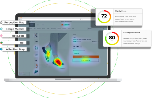
At EyeQuant we’re providing tools for just that: you simply upload a screenshot or URL and EyeQuant tells you within seconds what your website’s visitors are most likely to see and miss right away. This way, you can test and optimize your design’s visual impact step by step and within minutes.
We pride ourselves with working with the original neuroscientists behind attention modeling and currently achieve over 90% accuracy when compared to actual eye-tracking – you can tell we’re very excited about these recent findings.
Firstly, the study’s findings confirm what we see on a daily basis with plenty of our clients: what you see is what you click. Making sure that the important parts of your website stick out will almost inevitably increase conversions.
At the same time, we’re about to add automatic and actionable recommendations on how to improve your website – stay tuned and make sure to test your own website at EyeQuant!
Image credit: smemon

Check out our latest top tips on how you can use EyeQuant to spy on your competitors, analyse mobile...
Read more
In our latest blog we explore how to use neuroscience to help create higher performing digital products.
Read more
Figma is the go-to prototyping platform for many UX and web designers – and not without reason. Its functionality,...
Read more