We value your privacy
This website uses cookies to ensure you get the best experience on our website.
 Skip to main content
This website uses cookies to ensure you get the best experience on our website.
For the last couple of years, our friends at ConversionXL have compiled an annual State of Conversion Optimization report that details the progress made in the industry over time based on a survey of 333 optimization practitioners. The 2017 edition has landed, and includes all kinds of interesting stats.
The report includes a section on optimization tools and their relative usefulness. Unsurprisingly, A/B Testing and Analytics were the tool categories rated as most valuable. One thing that caught our eye was the inclusion of eye tracking in the survey, and the results show that it’s clearly one of the more controversial tools.
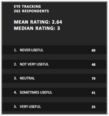
The CXL survey asked respondents to rate the usefulness of eye tracking “in terms of the insights you extract to make smarter optimization decisions”. Of 262 respondents, 25 rated eye tracking as “very useful” (the highest possible rating), while a full 69 people said it was never useful. Here’s the breakdown:
 Download the full suvey results here.
By far the most popular response was “neutral”, which likely signals that many respondents haven’t actually used eye tracking before, or at least they hadn’t used it enough to feel particularly positive or negative about it. This makes sense, as eye tracking is still somewhat niche.
If we exclude neutral respondents, 36% considered eye tracking a useful tool, while 64% think it has either limited usefulness or none at all. Why the great divide?
Eye tracking, more than any other insights method, has been held back by it’s sci-fi appeal and “cool” factor. Far too many people who try eye tracking will do it because it seems neat, but they won’t get real value from it. That’s not because eye tracking results are inherently useless – plenty of optimization teams get tons of value from it.
For example, here at EyeQuant, we offer our customers a visual attention analysis that’s driven by algorithms which have been trained with past eye tracking data. While our analysis isn’t exactly eye tracking, it provides similar results and is often referred to as “predictive eye tracking”.
We’ve seen customers use our analysis to generate million-dollar uplifts, and double or even triple-digit increases in conversion rates on their websites. For example, check out these case studies with Epson, Groupon, and British Gas.
So what separates those success stories from the optimization teams that get no value from eye tracking results?
You need to have a “wish map” in mind before you see your heat map, otherwise how will you interpret the results? To define that wish map, you need to realize that attention is a limited budget, and everything on the screen is competing for that limited budget. Users will not see, read, or engage with the majority of the content on the screen, let alone the entire page or website. You need to understand which content is “critical” and prioritize the visibility of that content.
Determining which content is “critical” can be done by interviewing some of your users, or using a visual hierarchy framework like The 3 Ws Approach.
A quick look at the “3 Ws Approach”, which is a useful framework for prioritizing content and defining which parts of the page users should ideally see right away.
Most people think of eye tracking data in a static way. It’s something you react to or design around because it’s representative of behavior, and that behavior is driven mainly by the wants, needs, desires, and intentions of the users being monitored. That’s true to an extent, but attention (and thus eye movements) is also driven by many bottom-up factors that you as a designer have tremendous control over.
For example, you can use luminance contrast, left-center positioning, or strategic white space to drastically alter what people see when they arrive on a page. There’s a simple playbook for influencing attention – the problem is that most people simply don’t have it. As a starting point, check out our video tutorial on Attention Hacking or our email course on neuroscientific design optimization.
A deeper dive into 3 “Attention Hacks” that you can use to influence or redirect user attention on any website, landing page, or email design.
Okay, so you’ve got a specific idea of which content you want people to look at, and you’ve made some changes based on the results of your eye tracking study. So far so good, but this is where many people run into another big pitfall: they don’t re-test the new design! This is corner-cutting, plain and simple. If you’re not willing to run a followup eye tracking study on your new design, why on earth would you be willing to ship that design to real customers and put significant actual revenue at stake?
Running eye tracking studies in the lab can be expensive and time consuming, there’s no doubt about it (that’s also where we can help). But unless you test your new design too, you won’t know for sure if the design changes are true to your actual hypothesis. Then when your A/B test results come in, what if you don’t get an uplift? You won’t know if it’s because you’re prioritizing the wrong content, or if your design changes simply didn’t impact attention as much as you thought they would. So what can you learn from your A/B test then? Not much!
The truth is, most re-designs or tweaks based on eye tracking data will need at least one revision before they’re ready to go live.
Take this example from Groupon. They used EyeQuant to understand which content was grabbing users’ eyes when they first arrived on a landing page, and found out that their 3 Ws weren’t immediately visible.

The perception map above shows which content is likely to be seen in the first 3 seconds after a user lands on the page.
The design team at Groupon made some changes to emphasize key content, but before they put the new design live for an A/B test, they tested it again to see if their changes had actually influenced where people will look. It turned out, some of their changes had worked, but others hadn’t! In particular, their call to action was still not grabbing users’ attention.

They never would have realized this if they hadn’t done a follow-up analysis of the new design. It took a further round of tweaks to create the experience they wanted for their users. The result was a 52% increase in signups.

If you know where you want people to look on your website, have a grasp on how to influence attention using design, and are willing to iterate, then you’ll almost certainly get meaningful insights from eye tracking. The next question is simply one of practicality. Running real eye tracking studies can be very time consuming and the costs don’t scale well, although there are many different approaches. Ultimately, it’s not for everyone.
If you don’t think regular eye tracking is a practical option for you, but you’re interested in getting similar insights, then be sure to check out EyeQuant, which is used by optimization teams at companies like Google, Canon, and Comcast.



We look at how to leverage predictive eye tracking to improve your Black Friday marketing campaigns.
Read more
In this article, we’ll discuss our data-driven approach to CRO, including fundamental tools and principles that will help to...
Read more
Great SEO brings users to your site. A great UX helps them achieve their goals after they arrive. Too...
Read more