We value your privacy
This website uses cookies to ensure you get the best experience on our website.
 Skip to main content
This website uses cookies to ensure you get the best experience on our website.
 At EyeQuant, we do a lot of eye-tracking as part of our mission to teach computers to see the web like humans do. The main purpose of our studies is to find the statistical patterns that power our attention models (which you can use to instantly test your websites!) Today, we’re sharing 3 of the most surprising insights we found.
A lot of you have asked us about general rules of thumb around what drives (and doesn’t drive) attention – in this post you’ll learn why rules of thumb are difficult to establish and how a lot of the common ideas we have about human attention are more complicated than they seem. In fact, what you’re about to read is going to be rather surprising and we’re hoping to dispel some common myths about attention and web design with data. 🙂
METHOD: We’re looking at data from one of our recent eye-tracking studies with 46 subjects who were purchasing products on 200 AdWords eCommerce pages. We recorded 261,150 fixations in total and users we looking at each webpage for 15 sec (+/- 6 sec) on average. The study was conducted in the Neurobiopsychology Lab at the University of Osnabrueck, Germany.
DISCLAIMER: Since the purpose of this study was to further expand EyeQuant’s predictive capacities, we’re also providing EyeQuant’s results for comparison next to the empirical data – please note that these predictions are based on a new EyeQuant model that’s currently in early testing, but are already quite close to the real thing (currently this model provides over 75% predictive accuracy (AUC, warning: math), whereas our standard model achieves over 90%).
This is probably one of the most universal design assumptions about human attention you’ll find on the internet: “as humans, we’re naturally wired to always seek out and look at at any available faces first.”
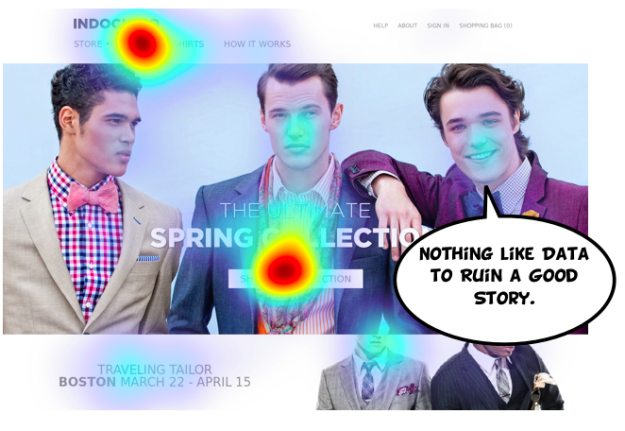
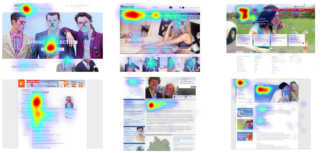
Roughly correct – except for when it isn’t. The truth is that as humans we do really like faces. We’ll look at them sometimes. We probably even have a dedicated brain area involved in processing faces. However, we look at them much less often than you would typically believe.
The data (click images to open a large version in a new tab):
Not convinced? Below you’ll find a lot more examples – from beautifully designed eCommerce shop to web 1.0 wall-of-text. We’re not saying faces don’t attract attention at all and are never looked at. Our data just shows that faces aren’t the powerful attention-grabbers as one usually thinks they are.

What about guiding user attention through faces?
This is another popular assumption which seems to make a lot of sense: we’re social beings and user gaze follows the gaze of faces on a website. Again, that’s true, except for when it isn’t:
What’s going on here? Our careful, explorative hypothesis is this: looking at a face does provide a sort of emotional buzz, so we may remember looking at them more than we do remember looking at other things. This might lead to wrong conclusions about general viewing behaviour.
Watercooler conclusion: “Faces are emotionally powerful, but they don’t always attract as much attention as we think they do.”
“Large text is a great way to attract user attention” is another rather popular idea about how attention works online.
However, our data shows that it usually doesn’t work. In a lot of cases big fonts even seem to have a negative effect on attracting attention:
What’s going on here? Our careful, explorative hypothesis is this: there may be an element of “banner blindness” involved. At the same, extremely large letters might be less readable for the human eye as well.
Watercooler conclusion: “Big typography is visually loud, but not at all a safe way to grab user attention. We need to look into other ways as well.”
It’s true: economically, nothing beats ‘FREE’. But does this also mean that the word pops out to users immediately when they’re visitig a page? Our data says otherwise.
Watercooler conclusion: “‘Free is a powerful semantical tool. We shouldn’t rely on it as our main attention grabber though!”
Rules of thumb are fun. They’re simple. And the more complex the thing is they’re trying to explain the more appealing they become. Alas, that’s also where they often fail – and visual attention is a rather complex, extremely context-driven system that cannot be captured in a set of simple rules.
What we’re doing at EyeQuant is to combine large amounts of data like the study above in lightning-fast computer models. As you’ve seen, our predictions come close to what you’d get from a real study.


Check out our latest top tips on how you can use EyeQuant to spy on your competitors, analyse mobile...
Read more
In our latest blog we explore how to use neuroscience to help create higher performing digital products.
Read more
Figma is the go-to prototyping platform for many UX and web designers – and not without reason. Its functionality,...
Read more