We value your privacy
This website uses cookies to ensure you get the best experience on our website.
 Skip to main content
This website uses cookies to ensure you get the best experience on our website.

The funny thing about working really, really, hard on something is that it tends to take someone completely outside of the task-at-hand to point out its most banal – and the most obvious – problems. When building and improving a landing page, collecting data on user attention isn’t just important for improving usability, it is also necessary to catch conversion killers that may have gone unnoticed – but have been staring you in the face the whole time.
This blog will explain why seeing isn’t always believing, how to find blind spots on your landing page’s design, and why the key to all this is understanding a little bit of neuroscience.
We tend to like to think of ourselves as multi-tasking pro’s these days; we talk on the phone as we drive, we scan our Facebook account as we speak to someone, we check our email or text while walking…
Or at least, we think we can multi-task. In fact, not only are we often blind to our own mistakes, but we humans aren’t even as good at multi-tasking as we would like to think we are:

Our brains tend to prioritise information, filtering out what doesn’t seem to be immediately necessary, but also switching between tasks in terms of priority. In a study from 2010, researchers at the University of Michigan conducted a study requiring a test-subject to switch between tasks during an FMRI scan. As the test was carried out, researchers found that there was always a little time lag during which the test-subject would switch from one task to another. The reason for this is quite simple: we humans can only direct so much attention to one thing at any given time, and so can only give a finite amount of energy to single task at a time.
Quick Takeaway: Make life simple for your users by giving them one clear, simple task when they arrive at your landing page.
Quick Takeaway: Users are busy people, and in order for them to instantly notice and understand what you do, why you do it, and where they can click your CTA, these elements need to stand out like a sore thumb in contrast to other, less important information.
Quick Takeaway: Identifying what to A/B test can be confusing because it is difficult to pick up on subtle visual problems that our brains automatically filters out. Small changes to color and size thus go unnoticed, which is why objective Artificial Intelligence is so insightful in letting us understand what our eyes (and brains) will direct attention to – and what they will ignore.

Chances are, you’ve done a great job of trying to understand your users: who they are, what you can offer them, and the circumstances in which they’re most likely to convert. As the studies above illustrate, though, it’s surprising how oblivious we can be to our own work, not to mention to the users that we are working for. As a result, landing pages almost always have a few blind spots: information that should be getting user attention, but are simply ignored – even if it’s in a user’s best interest to find it.
In fact, the human visual attention system directs attention based on a few dozen basic visual features, and when a user arrives at your landing page, those features kick into motion to help the user decide what they should be looking for. There are many visual features that infinitely combine to direct visual attention, but here are the 3 most important ones:
If your most important elements – What your page is about, Why the user should care, and Where they can go next – don’t take these features into account, chances are they will end up in a blind spot.
So, how do you know if your call-to-action is hiding in the dark?
EyeQuant’s Perception Map takes the guesswork out of analysing your own work and understanding your users by precisely predicting user attention based on a complex list of features that direct user attention. Areas that are visible to a user within the first few seconds of visiting your page are highlighted, while any information which will be initially ignored remains in the shadows.
Take a look at two examples of car rental pages to see what we mean:
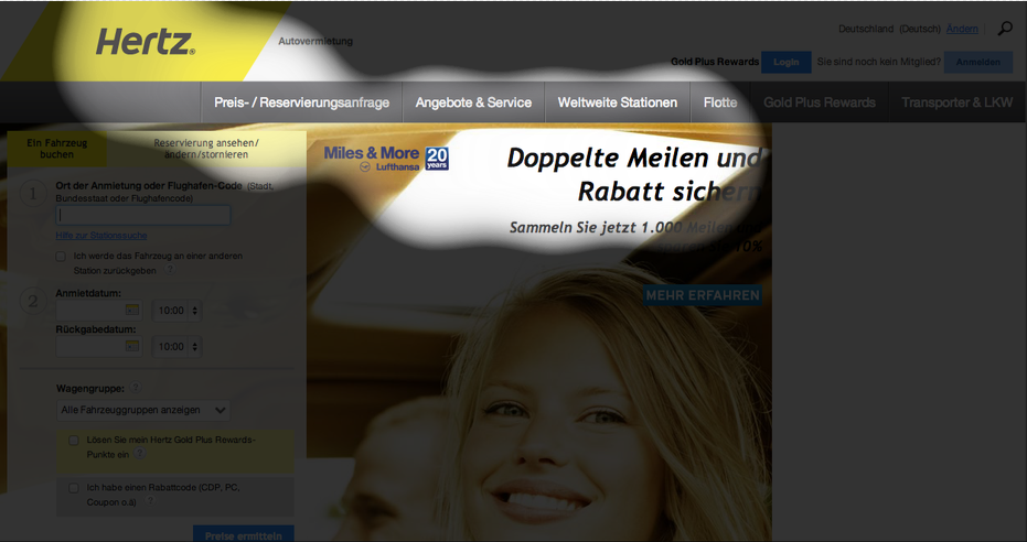

Building a landing page without a proper understanding of user attention can be a little bit like the blind leading the blind: You will be in the dark as to what your user sees and doesn’t see, and your user simply won’t be able to see what it is that you do, why they should care, and where they can go next if they like what they see. The result of this inability ends up looking a little like this painting by Bruegel:

So, what can you do? Use the technology available to you with EyeQuant to understand and accurately predict what a user will see – and what they will miss. We’re already performing this job for industry leaders like Google, Spotify, and Sixt, so why not take the chance to bring your landing page out of the dark – and start selling.

Check out our latest top tips on how you can use EyeQuant to spy on your competitors, analyse mobile...
Read more
In our latest blog we explore how to use neuroscience to help create higher performing digital products.
Read more
Figma is the go-to prototyping platform for many UX and web designers – and not without reason. Its functionality,...
Read more