We value your privacy
This website uses cookies to ensure you get the best experience on our website.
 Skip to main content
This website uses cookies to ensure you get the best experience on our website.
The budget hotel business isn’t easy. In a crowded, price-sensitive market, it can be difficult to stand out. For budget hotel brands, a good website is one of the few ways to make a positive impression on potential guests before they choose a place to stay. In this post, we’re going to rank 8 of the top US budget hotel brand websites and see which ones deserve 5-stars in terms of design, and which ones don’t.
To do this objectively, we analysed the homepage of each site with EyeQuant, the A.I. for instant, scientific design analysis (built by applying machine learning to user research data). We then rated the different sites based on 4 criteria: their visual clarity and excitingness, and the visibility of their brand logo and CTA.
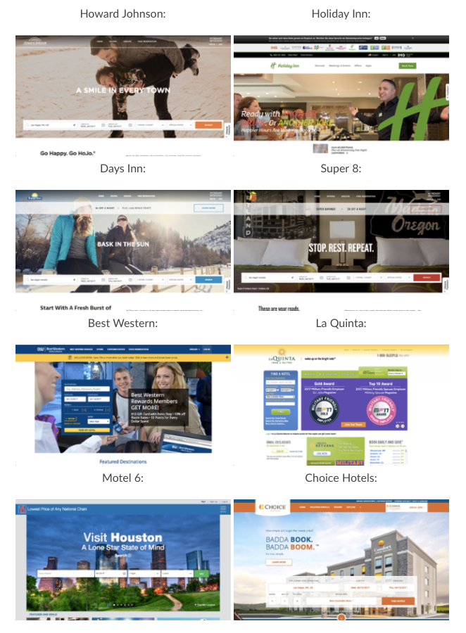
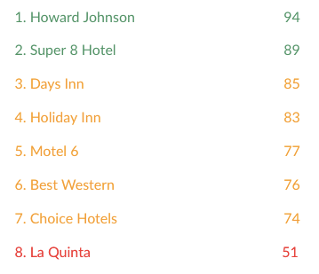
One of the most common sins of web design is having too much clutter on your homepage. So let’s start by looking at which website has the clearest, cleanest design. This is important because cluttered design causes cognitive load, which means a greater likelihood that users will get confused or distracted and leave your site.
To see the differences, we can take a look at the two extremes:
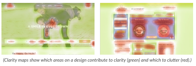
Howard Johnson did a great job at keeping distracting elements to a bare minimum. La Quinta on the other hand still tries to present as much information as possible on their homepage. This lead their design to have a far lower clarity score than the others.
Another possible pitfall is being too boring! People want their stay at a budget hotel to be pleasant. They’re travelling, perhaps visiting a city they haven’t been to before – that should be exciting. If a brand doesn’t appeal to that desire, they risk losing out to a competitor. So which website is most visually exciting?
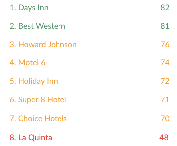
Both the Days Inn as well as Best Western designs are forerunners in terms of exciting design. Again, La Quinta is in last place.
This is a basic element of conversion-centred design. If you visually guide users’ eyes towards the desired next action, they’re more likely to actually do it! So which site does the best job of visually emphasising the next steps by making sure users will see the call-to-action?
(These scores measure how visible specific content is compared to the page average, so a score of +100% would indicate that an element is twice as visible as the average content on the page.)
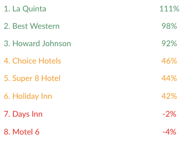
If we take a look at Motel 6’s site, we can actually see why their CTA blends into the background and isn’t visible right off the bat:
.png)
(This heatmap shows the most attention-grabbing spots on a design from red to green.)
While the headline is in focus right away, we can see how large amounts of the background image distract the user and lead away from the booking widget and CTA.
All of these budget hotels are well-known, and they’ve all spent a lot of time and effort building a brand that means something. When people see “Holiday Inn”, they likely associate this with positive things – there’s a reputation that can be leveraged to get people to take that next step and search for room availability.
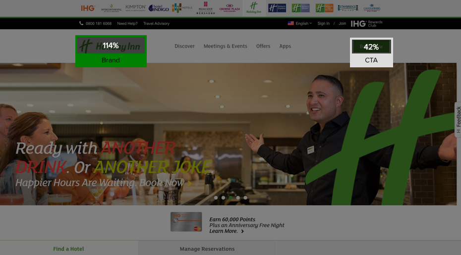
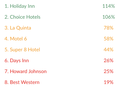
Which site does the best job of visually emphasising their brand by making sure people will see their logo?
One of today’s key design principles is that clarity is not just important, but essential. With everyone trying to grab your attention, stick to the one action you want your users to perform and focus on that.
This is exactly what is happening in the budget hotel industry (and travel industry in general). They keep their designs simple and leave out any superfluous fluff from their landing pages. Having the clearest site can then result in a significant competitive advantage.
But clarity alone won’t cut it either. You want your sites to motivate your users to hit that CTA and move closer to that perfect vacation. Here, exciting designs are definitely the way to go in this industry (which makes total sense). Of course, you could also try something different and create a super calm and clean landing page and see how it goes – there just might be a niche for it!
If we look at these results visually, we can see that, in terms of clarity and excitingness, there’s a clear pattern here:
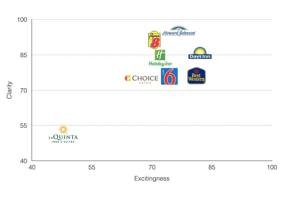
(Designs towards the bottom left will be perceived as cluttered and boring, designs towards the top right as clean and exciting.)
Although the three least cluttered sites – Howard Johnson, Super 8, and Days Inn – all share the same template, they’re a prime example of how background images can affect both the clarity and excitingness scores.
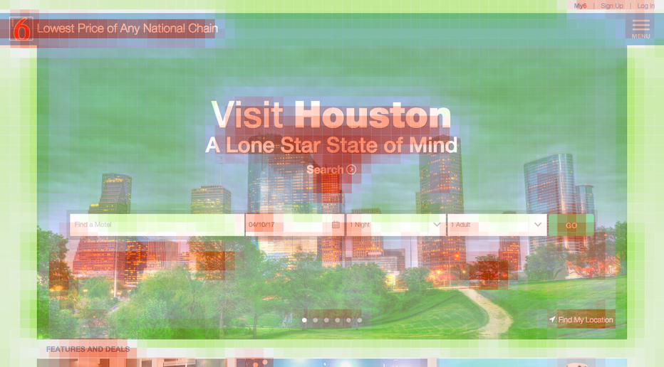
Similarly, Motel 6 has a super simple design that emphasizes their booking widget, yet their background image leads to a high loss of clarity due to its intense contrasts (here, red areas contribute to clutter, green areas to clarity).
Although La Quinta scored lowest in terms of clarity and excitingness, it doesn’t mean that their site can’t be effective. While being last in both our first categories, they are 1st with regard to their CTA’s visibility, and their brand logo’s visibility made 3rd place.
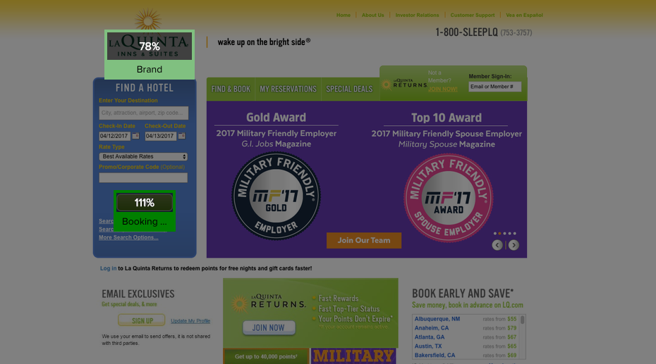
This means that their site naturally leads users’ eyes to the most important bit – the next step in booking with La Quinta. Yes, it’s cluttered. But it still does its job.
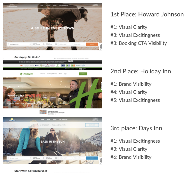
Super8 Hotel and Best Western tied for 4th, followed by La Quinta on 5th place. Finally, we have Motel 6 and Choice Hotels who tied for last.


Check out our latest top tips on how you can use EyeQuant to spy on your competitors, analyse mobile...
Read more
In our latest blog we explore how to use neuroscience to help create higher performing digital products.
Read more
Figma is the go-to prototyping platform for many UX and web designers – and not without reason. Its functionality,...
Read more