We value your privacy
This website uses cookies to ensure you get the best experience on our website.
 Skip to main content
This website uses cookies to ensure you get the best experience on our website.
We tend to like to think that we are aware of everything going on around us; after all, we are conscious human beings, and we notice changes to our surroundings, right?
Well, not exactly.
In this post, we’ll look at a phenomenon of human consciousness that is subtly affecting the way we actually see the world – and the way in which users look at your website.
Let’s start by taking part in a quick experiment in the video below (and make sure to watch it in full screen!):
Experiments like the one above work like magic tricks, cleverly masking the changes that occur during the switch between what are in fact two quite different images.
Chances are, once you noticed the alterations to the webpage, they became almost impossible to stop staring at. What you just experienced is a phenomenon called change blindness: in order to notice the (not so) subtle alterations to our environment, our attention has to be consciously drawn to them.
Change blindness occurs when a change in visual stimuli goes unnoticed, especially if our visual attention is not focused directly on the change.
To give you a better idea of what we mean, take a look at this video by NOVA :
Change blindness pops up all over the place. In Luis Bunuel’s seminal 1977 film Cet Obscur Objet du Désir, two actresses were cast in the place of one, symbolically showing that the male protagonist could not understand “the true nature of his lover”. When the film first screened, many viewers (including this article’s author, truth be told) simply didn’t initially notice that the role of the intriguing Spanish vixen was played by two entirely different people.
So far, scientists don’t know precisely why change blindness occurs, but they do have preliminary explanations and know that it carries certain implications:
Change blindness occurs when a change in our visual field is not consciously “attended” to; our eyes are not expecting the change, so they don’t process it.
Visual perception occurs on a two-fold level: First, the optic nerve transfers information about a physical (rather than emotional) change to the visual cortex at the back of the brain. Very soon after this information reaches the visual cortex (for lack of a better theory) subjectivity emerges. Your brain must decide, for example, if it’s seen a change in what it’s looking at, or if it is mistaken. In other words, the real mystery of the way we see things is to build a bridge between the information that the visual system gives to the brain, and how the brain transforms this information into experience.
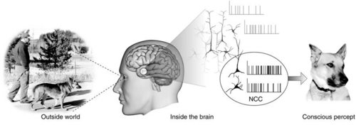
Kevin O’Regan, visionary neuroscience philosopher at the Centre National de Recherche Scientifique in Paris, explains the phenomenon this way:
“Perhaps the most natural view to take is to suppose that what we have the subjective impression of seeing is not the very sparse, more semantically coded, content of visual memory, but the content of a shorter-lived but higher quality, image-like replica or “icon” of the visual scene. The impression of richness that we have from the world would derive from this high-quality icon. On the other hand, only a small portion of the icon’s contents, namely the parts that have been attended to, would at any moment be transferred into memory and be available for doing tasks like change detection — the rest would be forgotten. This view of visual processing has been called “inattentional amnesia” (Wolfe [1999]): the idea is that we see everything, but forget most of it immediately.”
Just as in everyday situations, change blindness plays a role in the way we look at and understand websites. We may think that we are aware of all available information when we arrive on a web page, but the simple fact of the matter is that our brains can only take in so much at once.
In general, there are 3 key lessons to be learnt from how change blindness influences the way users look at your website:
Back in 2010, UX magazine posted a brief article alerting UX professionals to the role of change blindness in UX; “What are we failing to capture when observing people using the products we design?”, queried the author.
When optimizing a website, everyone involved makes hypotheses about what needs to change on a page; perhaps it’s the copy, a button colour, or a background pattern. Coming up with testing ideas is often based on intuition and experience, but even an experienced designer or optimization expert is likely to miss key problems. In fact, a study from the University of Copenhagen showed that experienced web designers could only predict how a user would view a website with just 46% accuracy.
Predictive eye-tracking does an excellent job of solving this problem by removing subjectivity from the testing equation. Heatmaps and other visualizations show what users will initially see based on finely tuned algorithms and years of research – not subjective opinion.
Remember the Amazon landing page experiment you conducted beginning of this post? Here are two EyeQuant Perception Maps (before and after the changes) of the Amazon.com homepage featured in the video, predicting what users will see within the first few seconds of arriving on the page:
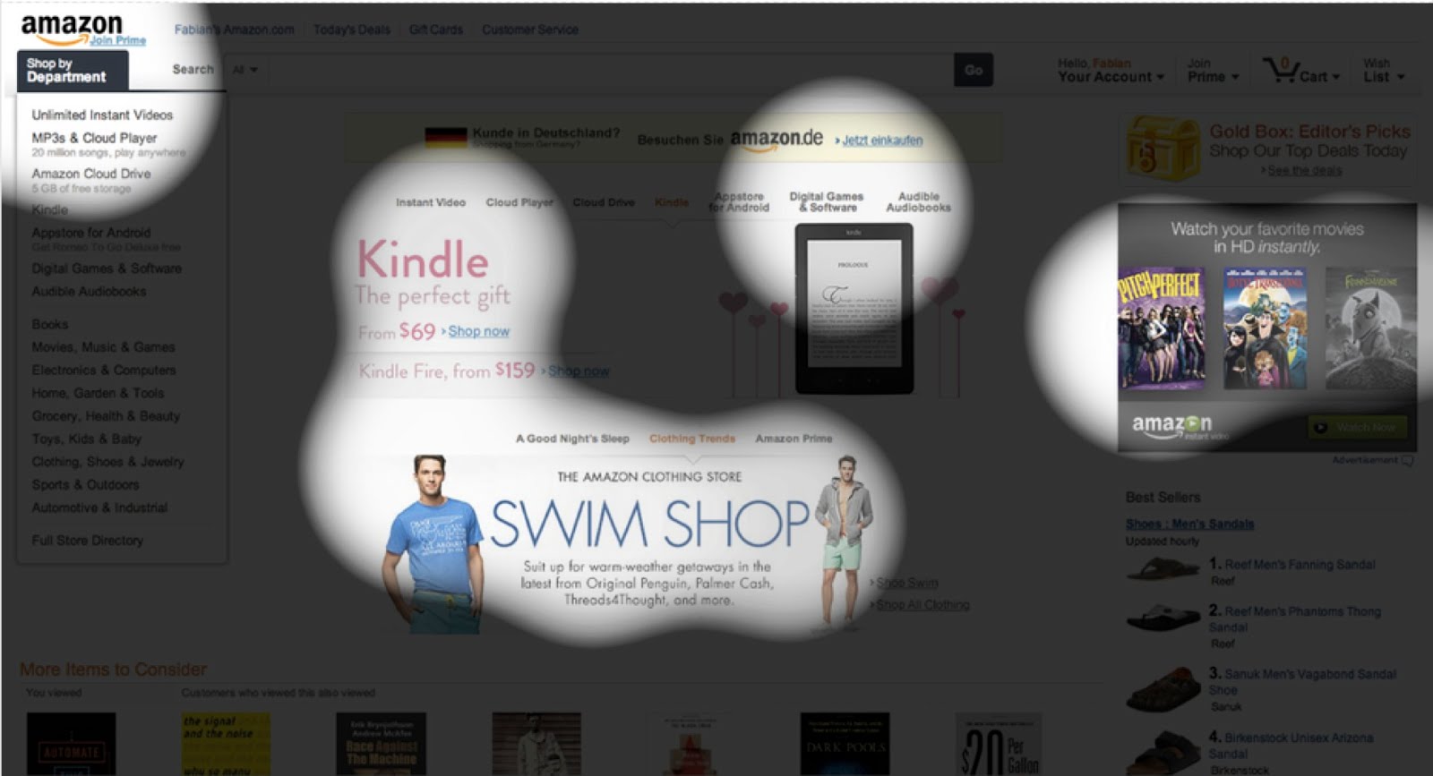
While three main areas of visual attention remain the same, the illuminated region to the far right changes dramatically with a simple change to the “best sellers” content on the bottom right, from mens’ sandals to beanies and hoodies. Suddenly, attention is pulled away from the grey box entitled “Watch Your Favourite Movies in HD Instantly”, and drawn downward. This is not because users are reacting more emotionally to beanies and hoodies than sandals, but simply because the former produces a larger block of dark colour, thus more easily drawing our eyes toward it.
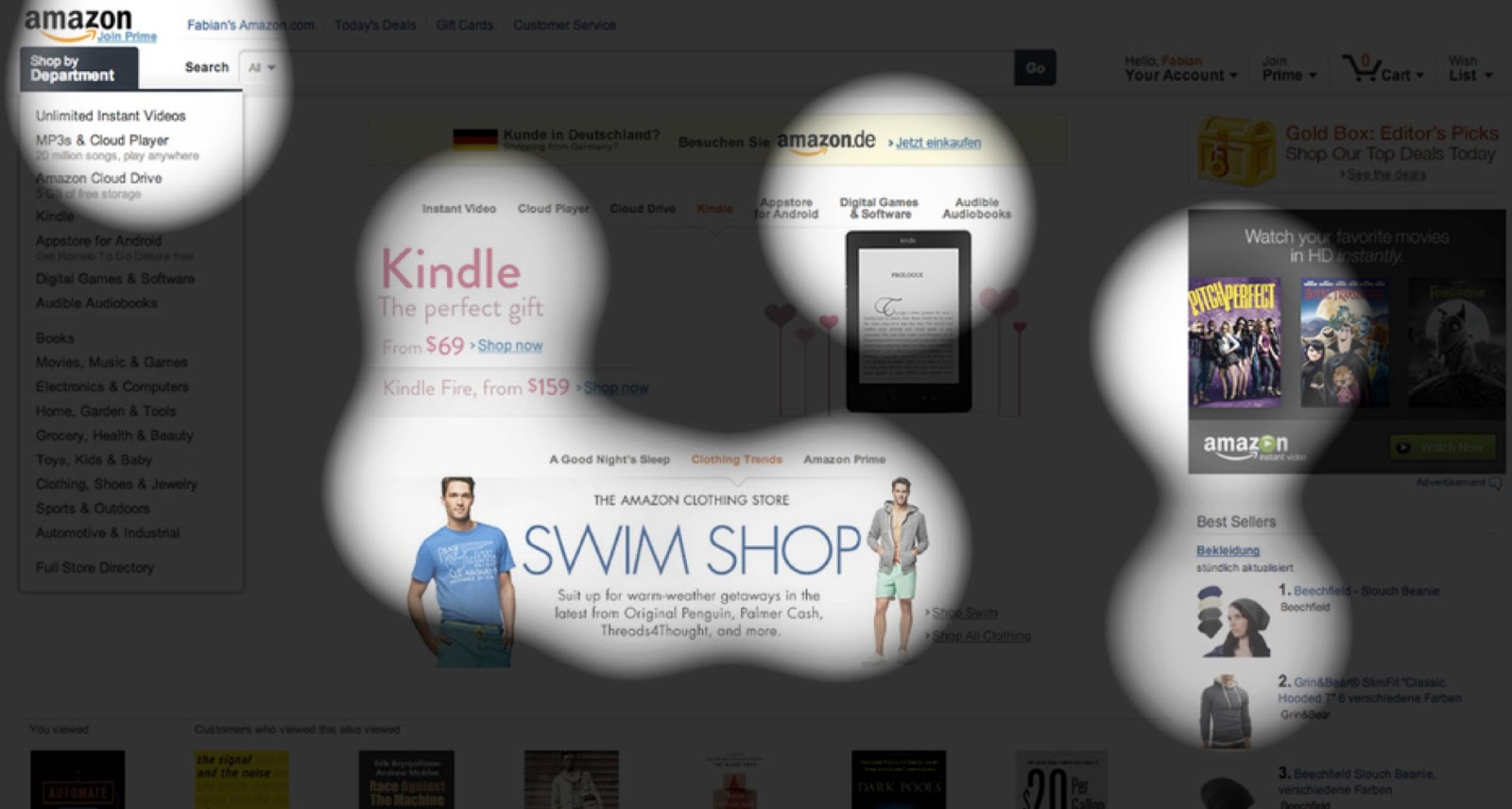
Herein lies the crux of this lesson: When testing design and content changes on a website, we tend to focus on a single element at a time, such as the colour of a CTA button or the size of a headline; however, the circumstances of change blindness (and the results of an EyeQuant test) show us that small changes to one element also change the way a user looks at anything around that element as well.
When tweaking design elements, it’s crucial to consider not just the attributes of a single element, but how it will alter a user’s gaze on the entire page. Will enlarging the headline draw user attention away from the product image on its left? Will moving the CTA from centre-right to dead-centre draw attention away from the core benefits? The best way to find out is to test, tweak, and re-test until you find the winning combination.
We’ve said it once, and we’ll say it again: If you want potential customers to click something, read something, or buy something…
…You have to draw their attention toward it.
Users won’t perceive existing elements or even substantial webpage changes – even if they are right in front of their eyes. So, how do you draw their attention to the regions of a web page you want them to focus on? Try these steps:
For a little inspiration, take a look at EyeQuant customer and conversion experts WHOLEGRAINdigital’s optimization process:


To learn more on this fascinating facet of human consciousness and how scientists are studying it, take a look at this this seminal paper by Simons and Rensink, or this talk by pioneer of the science of consciousness (and EyeQuant Scientific Advisory board member) Christof Koch, speaking about the brain, consciousness, and even change blindness:

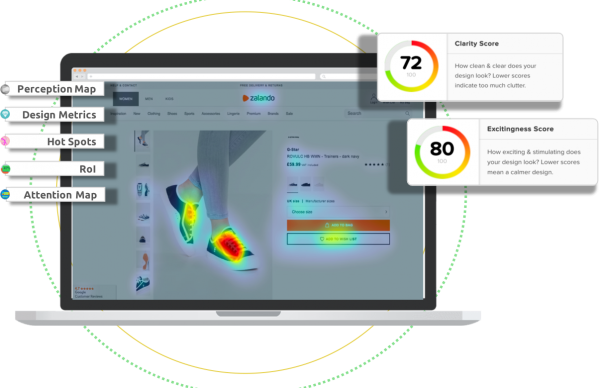
Check out our latest top tips on how you can use EyeQuant to spy on your competitors, analyse mobile...
Read more
In our latest blog we explore how to use neuroscience to help create higher performing digital products.
Read more
Figma is the go-to prototyping platform for many UX and web designers – and not without reason. Its functionality,...
Read more