We value your privacy
This website uses cookies to ensure you get the best experience on our website.
 Skip to main content
This website uses cookies to ensure you get the best experience on our website.
EyeQuant’s ground-breaking pre-live analytics and insights technology empowers brands to predict what users will see, how they will be emotionally stimulated and how they will engage with digital designs, before they go live.
The result is nothing short of a game-changer for anyone concerned with boosting conversion rates, cutting out hundreds of hours of unnecessary testing, saving on expensive burned traffic and ultimately enabling companies to boost revenue by millions.
EyeQuant’s research, which was conducted by one of Europe’s leading Neurobiopsychology Labs at the University of Osnabrück, shows that people will form an opinion of a website within 50ms while 80% of all content on websites is ignored. Throw in the fact that there are over 1.25 billion websites in the world fighting for people’s attention and it becomes clear just what a huge challenge CRO and eCommerce professionals face.
EyeQuant’s mission is to allow brands to stand out in this congested world with the most effective and efficient designs. Google, Groupon, Canon and Epson are just some of the names among hundreds of leading brands that are transforming their business with the power of EyeQuant’s pre-live testing.
Adopting the 3 Ws framework of what is the page about, why should visitors care and where should they go next, EyeQuant’s cutting edge attention and perception tools predict which elements will capture most attention, but also crucially reveal which areas will be ignored or missed out.
It was using this approach that allowed Groupon to increase sign up conversion by 52%.
Before coming to EyeQuant, the world’s leading daily deals site already had a data driven culture with a rigorous A/B testing strategy. However, the team wanted to understand how they could make significant changes rather than ongoing small tweaks to their existing design, which is often the case with iterative A/B testing.
By simply inserting the URL of their key landing page into the EyeQuant system, Groupon was able to see instantly that their value proposition and call to action were being overpowered by the imagery and not being seen in the first three seconds.
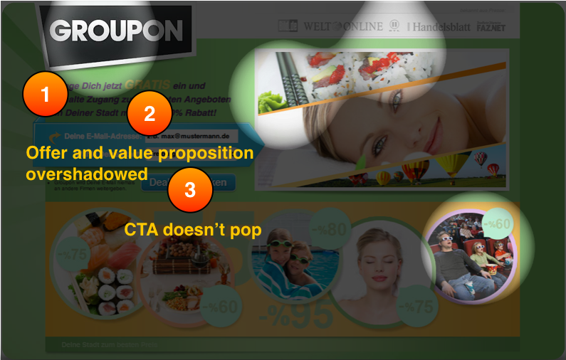
EyeQuant showed within seconds how Groupon’s key CTAs were being overshadowed.
Crucially Groupon was then able to pre-live test a series of mock-ups, allowing them to optimise each element of the page before they burned traffic on testing with live users.
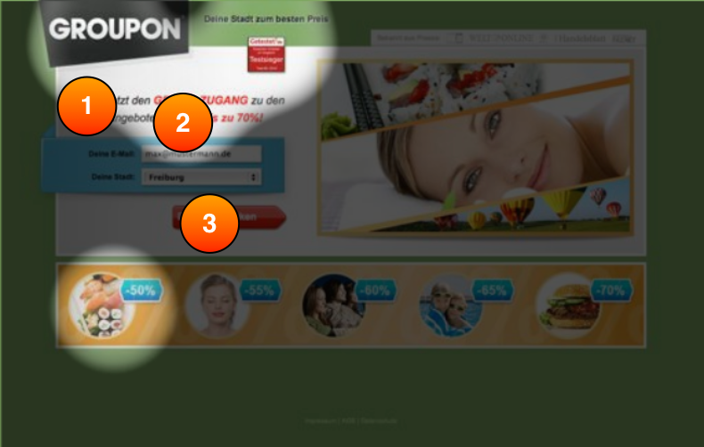
By pre-live testing the next iteration of designs it was clear the bottom banner was still overshadowing the CTA.
When the page went live there was a 52% increase in sign up conversion, all achieved without burning through expensive traffic and a lengthy post live A/B testing process.
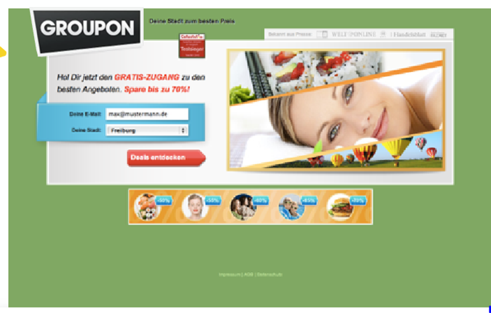
A reduction in the banner ensured the 3 Ws were all clear in the first 3 seconds, resulting in a 52% increase in conversion of sign ups.
Lydia Wright, is Head of Conversion Rate Optimisation at Somebody Digital, a leading London-based agency that puts data and ROI at the heart of everything they do.
“Here at Somebody Digital, we use a selection of insights and analytics tools to analyse a client’s conversion challenges and opportunities to build robust testing hypotheses and test plans. EyeQuant is one of my favourite tools, and I wanted to share a couple of examples of cases where it’s created great value for us and our clients.
“Most analytics tools are great at uncovering what is happening on a web page – website analytics, click tracking, scroll maps, session recordings and more. Crucially, EyeQuant can help explain why an observed behaviour is happening.
“In the example below for client Fabergé, a low click rate on the ‘Add to Shopping Bag’ call to action was noted. EyeQuant helped explain why this trend was being observed – the e-commerce journey was getting a very low share of visual attention on the page and simply not being seen. Did users even realise that this is an e-commerce site and not just brochureware?
“Based on this insight, a test was designed to increase the visibility of the e-commerce journey on the page. The new design (which was validated with EyeQuant ahead of time) delivered a whopping 46% increase in users adding an item to their shopping bag.
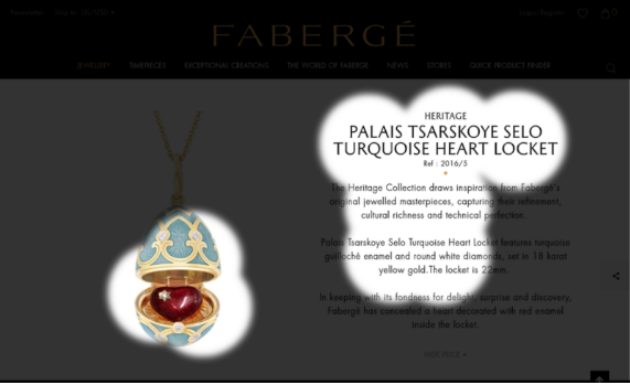
The EyeQuant Perception Map shows what visitors will see and miss in the first 3 seconds after arriving on the page.
“Web design has traditionally been quite a subjective aspect of conversion. Adding EyeQuant to the CRO toolkit has allowed design to be quantified for the first time – removing subjective debates and enabling us to validate a design idea before committing to an A/B test.
“Proving that the visibility of a component on a page has increased, the share of attention has changed, or the clarity of a page has improved is invaluable in gaining quick buy-in from clients and sign-off on A/B tests.
“In the below example from client The Ticket Factory, the design is validated using EyeQuant – showing that the visibility of the new “Get Tickets” call to action is significantly more visible than the button in the original design.”
 EyeQuant Regions of Interest analysis, measuring the specific visibility of different regions, based on Visual Attention Data.
EyeQuant fuses pioneering neuroscience research with cutting edge artificial intelligence to enable brands to predict how users will engage with their digital assets.


We look at how to leverage predictive eye tracking to improve your Black Friday marketing campaigns.
Read more
In this article, we’ll discuss our data-driven approach to CRO, including fundamental tools and principles that will help to...
Read more
Great SEO brings users to your site. A great UX helps them achieve their goals after they arrive. Too...
Read more