We value your privacy
This website uses cookies to ensure you get the best experience on our website.
 Skip to main content
This website uses cookies to ensure you get the best experience on our website.

There’s something about the idea of copying your competitor that dredges up unpleasant memories of the bleary-eyed bully you sat next to in primary school eyeing and scribbling down your test answers. Fervid observation of an opponent has never looked so desperate, hopeless – and lame.
On the other hand, your primary school copycat is a far cry from the oozingly cool, “international spy” style of observation you’ve come to embody in your marketing and analytic strategy, in which you nonchalantly sip a martini with a raised eyebrow, anticipating every subtle gesture of your nemeses.
As an online marketer, the latter is the position we all want to be in – prescient, achingly precise – and successful.
Not so long ago, an EyeQuant agency customer contacted us asking for feedback. One of the agency’s clients wanted to re-design their landing page and hoped to use the visual structure of a well-known competitor as a design guideline. The agency knew that the client’s main competitor’s landing page was converting very well – much better than the client’s landing page – and so the agency began to explore reasons why this might be.
After a simple investigation, the agency learned that the competitor had a number of landing pages directing traffic from a series of sources (email, PPC, and organic search, etc.). The agency’s in-house strategy manager ran the landing pages through EyeQuant to find out what users were seeing on these distinct landing pages when they first arrived – and subsequently why these pages were selling so well: What were the competitor’s users seeing (and responding to) when they first arrived at the competitor’s pages that their client’s users were not?
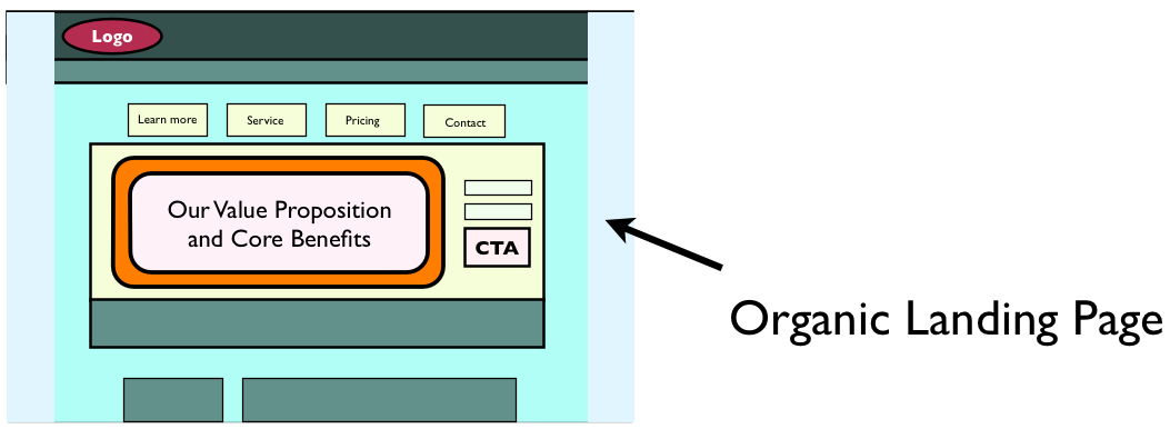
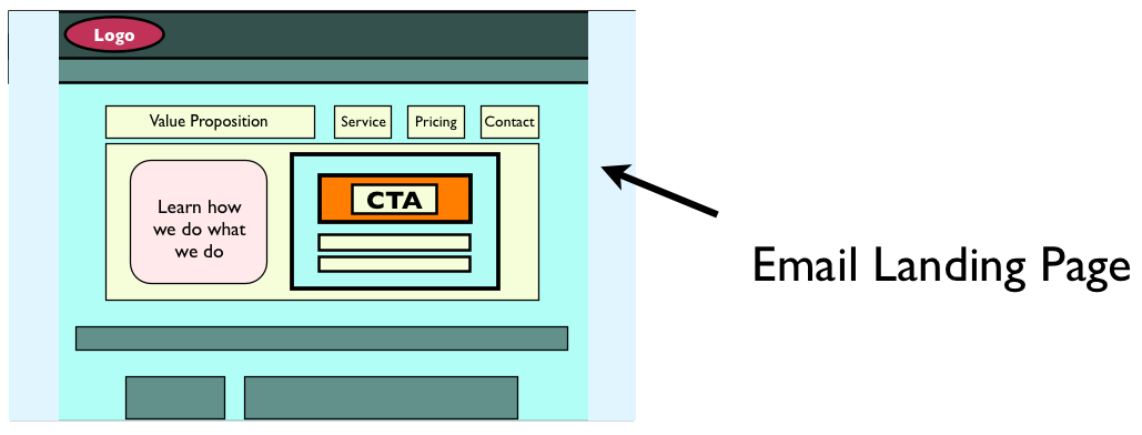
With each landing page, the agency noticed through the attention heatmap results that, depending on the kind of landing page tested, the competitor’s user’s attention was being deployed to very distinct regions:
while,

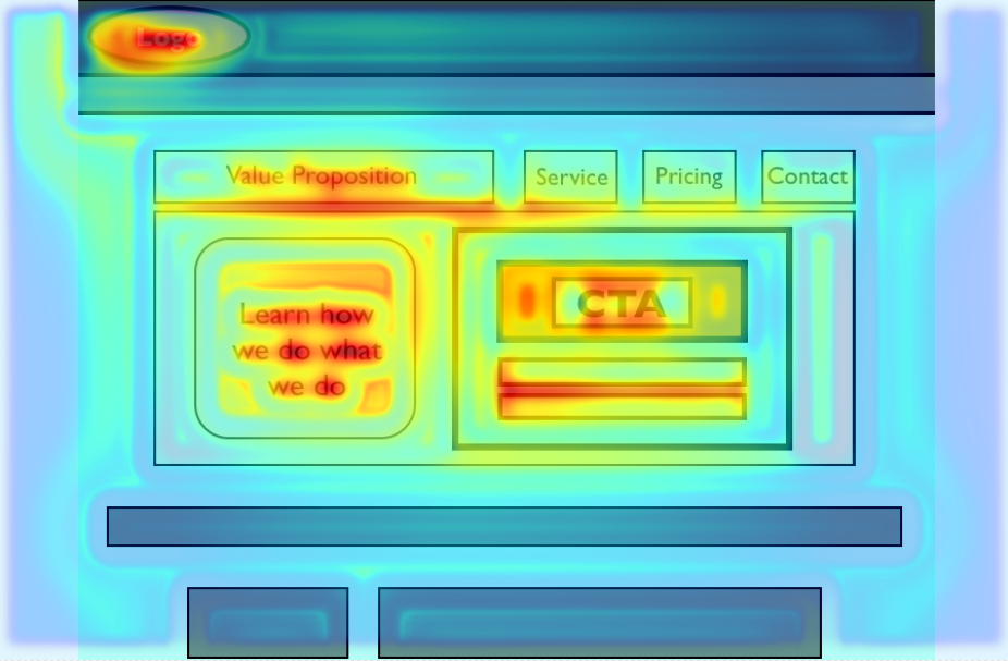
For the client’s competitor, users arriving at the organice-search landing page were likely to require a more thorough backstory to the product, replete with clearly visible use cases and benefits. If users arrive from an email campaign, meanwhile, the core value proposition would likely already be clearly communicated to the user, meaning that immediate awareness of the call-to-action the opportunity to have a more in-depth understanding of the product would take priority.
With these competitor insights, the agency convinced the client that it wasn’t the competitor’s color scheme and copy they should consider replicating, but the actual visual attention structure of information according to where traffic was being directed from.
Using Google Analytics, click-tracking, and EyeQuant, the agency created a structure for their client that mapped what users were looking for, clicking, and seeing when they arrived from a specific traffic source, then compared this data with their knowledge of their competitors to design and test their client’s new landing pages.
At the crux of this story is the question of formulating a successful “attentional hierarchy”.
The attentional hierarchy of a landing page refers to the order and intensity with which key elements on a page – whether it be the value proposition, pricing, the CTA, or a giant product photo – will receive user attention.
Every consumer interaction begins with the blink of an eye, and the regions of a page that visually pop-out first frame a user’s crucial first interaction with what the landing page is selling. In other words: put all the emphasis on the CTA, and the user will never understand why the product is valuable to them. Put all the emphasis on the product’s benefits and use cases, and the user will have a hard time figuring out where to actually buy the product.
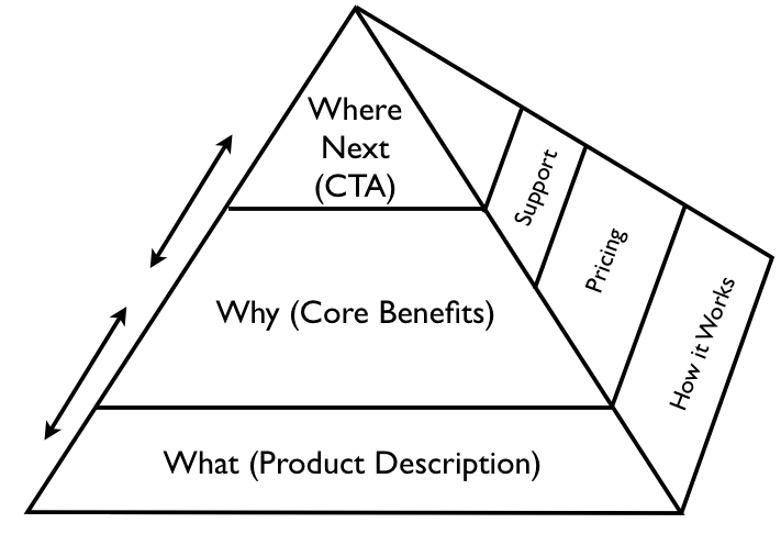
A good way to begin conceiving of your attentional hierarchy is by breaking down your landing page’s priorities with the 3W’s. The 3W’s form the core information that should be immediately available to a user upon arriving on a landing page.
The 3W’s are:
Your 3W’s can come in a number of different forms depending on what proves to most effectively communicate them. A what could be product photo just as it could be a concise description, while a where next is the button or form you most want users to interact with.
Once a basic attentional hierarchy of your 3W’s has been formulated, you can begin optimizing and testing to find the right balance between these three crucial elements (predictive eye-tracking is a quick and cost-effective to test this). The order and structure of the hierarchy may take many forms, but this is precisely the point: each landing page and each product is different, and subject to individual needs. Only through processes of iteration and testing will you come to the formula that works best for any of your specific landing pages, and for your specific product.
Building and optimizing your landing page with the 3W’s and the attentional hierarchy is dependent on the process of testing the contexts in which your users best understand your product.
Whether you’re just starting out, or whether you’re already an established brand looking to tweak or re-design your landing pages, studying your competition during your analytics and testing process is absolutely crucial. You may not be able to know their bounce rate or their precise conversion rate, but you will gain important insight into the design frameworks your competitors have put in place to draw in user attention at the right moments – and to the right content.
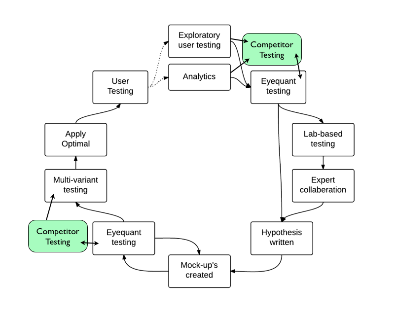
One of EyeQuant’s most recent (and beloved) clients, Stuart McMillan of Schuh, sent us a diagram of his design and testing process recently, which gives excellent insight into a well-honed optimization and testing strategy.
To add to this already stellar cycle, we included the moments in which competitor analysis and testing can and should come in:
You will never be your competitor – and this is a good thing. Embrace intelligence – your uncanny ability to acquire and apply knowledge – over copying.
In a recent blog post, Conversion XL’s venerable Peep Laja poignantly eschewed copying competitors over analytics simply because your competitors probably don’t know much more than you do. While this is very likely the case, observing and testing your competitors strategies (whether they are aware of them or not) can be as effective as seeing your own landing pages from a bird’s eye view: suddenly all their mistakes and all their successes become clear, which should provide you and your business with some pretty good testing fodder.
Copying your competitor doesn’t work just because your competitors don’t know what they’re doing, it doesn’t work because successful conversion is contextual: it relies on careful analytics, continuous testing, and critical thinking. All the same, observing and testing what makes your competition successful will provide actionable insights into ways to structure your own attentional hierarchy and 3W’s pyramid, and ideas for what to A/B and multivariate test.

