We value your privacy
This website uses cookies to ensure you get the best experience on our website.
 Skip to main content
This website uses cookies to ensure you get the best experience on our website.
The Overloaded Cart Page: Even Zappos is Committing this UX Sin.
Working in the UX space rapidly leads to a different perspective on web design. You start looking at things through a different lens. Suddenly UX issues stand out more and become frustrating not just from a user perspective, but also a professional one, since many of them could easily be fixed.
One of these issues is the overloaded cart page. Once users land here all they really want to do is move on and pay. Yes, there might be a form or two that need to be filled out, but still the process should be quick, simple and straightforward. One shouldn’t have to search the entire screen to find that one CTA everyone is looking for.
Sadly, many ecommerce sites struggle with this and don’t have an effective visual hierarchy in place. For example, I recently landed on Zappos’ cart page and this is the design I faced:
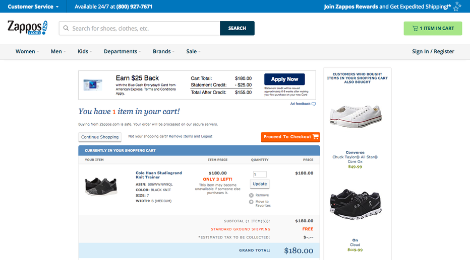
It was surprising to see how much stuff they present at this stage of the user journey. 3 CTAs, an ad for a credit card, heaps of text, and lastly, somewhere in the middle, the product that was placed there.
For regular Zappos shoppers this cluttered impression might fade into the background at some point. But what about first time users, or users that only drop by once in a while? It’s easy to quickly get lost and have to start searching! There’s no clear visual hierarchy that leads to the next step. To show you what I mean, here’s a predictive eye-tracking result from EyeQuant that shows which content will actually stand out to users when they land on this page:
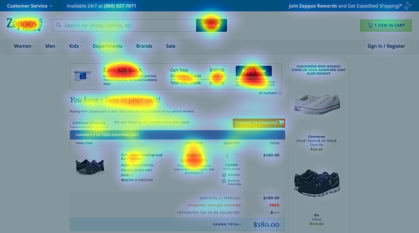
You can see that lots of different elements are attracting users’ attention (the red – yellow areas). Attention is scattered all across the page and nothing really stands out. The one element that leads users to the next step (“proceed to checkout”) barely receives any heat and might place more cognitive load on users than necessary. Also, the value propositions like “free shipping” or “free returns” are completely getting lost due to distracting content like the credit card offer.
One of the reasons why attention is all over the place is because the image is overloaded with content. Think of it this way: the more content on a page, the more elements are competing for attention. This makes it harder to ensure that the most relevant elements are actually in focus. In this case, it’s absolutely necessary to make use of something called luminance contrast. Luminance contrast is the difference in the perceived brightness between an object on the screen compared to its surroundings. Here’s an example:
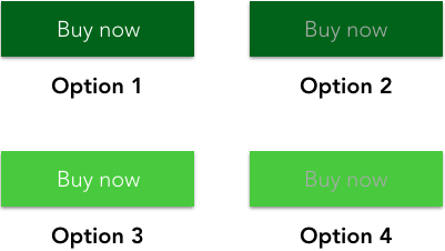
Luminance contrast is incredibly strong at attracting attention. This is important for effectively guiding users’ eyes to the content that matters most. On Zappos’ page for instance, the CTA for the credit card offer has high luminance contrast (dark background, white font). The “proceed to checkout” CTA can’t compete here, since its luminance contrast is much weaker.
To make this CTA stand out more, Zappos could tweak the design such that the next step stands out more than the credit card offer. By changing the luminance contrast of these two buttons you get to the following attention heatmap:
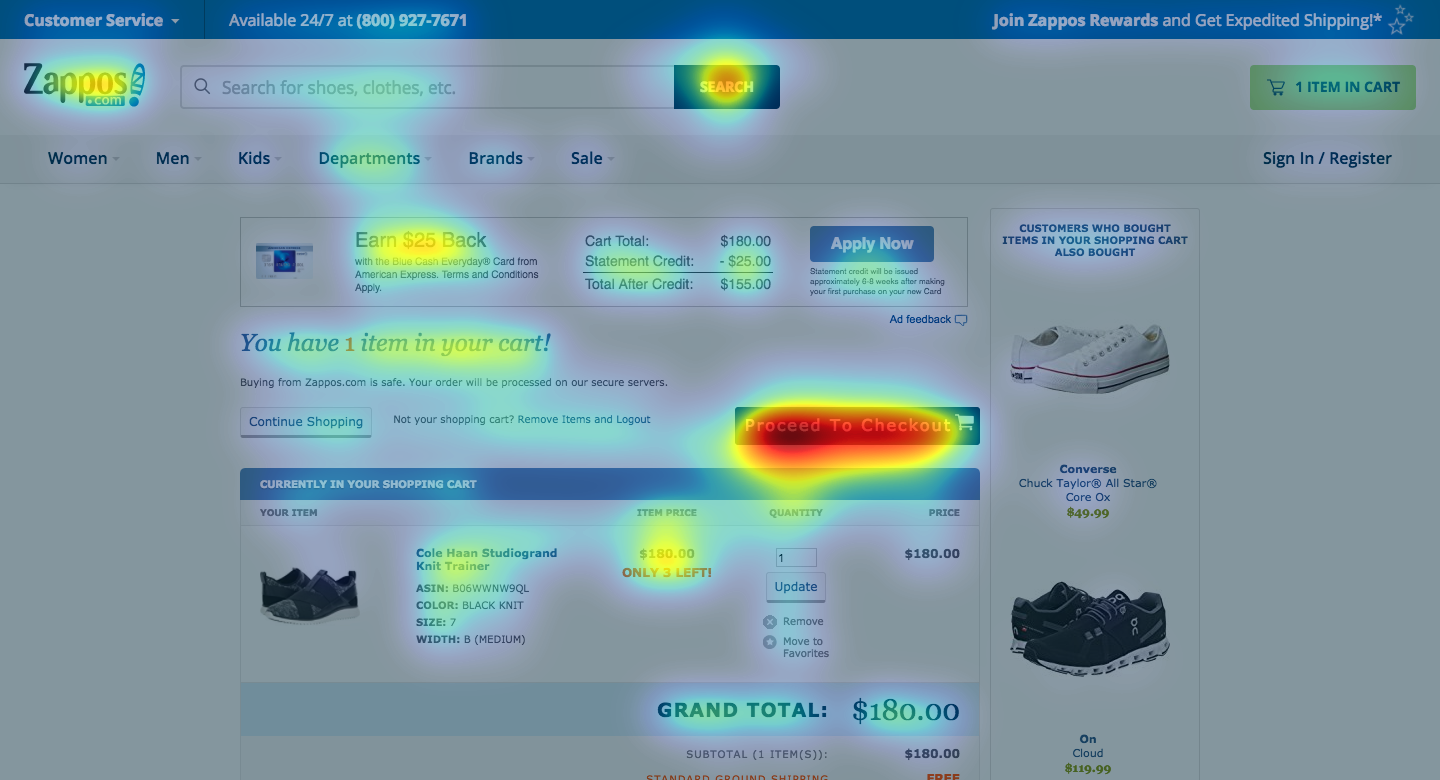
The only changes are the color of the credit card and proceed to checkout CTAs, along with a small increase in size of the latter. Now, the next step is immediately in focus which would increase the chances that users will proceed to checkout. It’s almost asking to be clicked! At the same time it decreases the likelihood of customers leaving the page. Designers have a lot of control over what users first see when they land on a page once they know how.
