We value your privacy
This website uses cookies to ensure you get the best experience on our website.
 Skip to main content
This website uses cookies to ensure you get the best experience on our website.
It’s Tuesday morning and retailers across the world are breathing a collective sigh of relief. Although the holiday shopping season still has nearly 4 weeks to go, the high-stakes, ultra-stressful Black Friday and Cyber Monday are behind us. For retailers, the last few days were all about executing on the strategies that have been carefully planned for months. According to a piece in the Washington Post, a common goal this year was to win over a coveted new breed of omnichannel shoppers who “ping-pong from physical stores to laptops to smartphones, and a purchase can come via any of these avenues at any time.”
For most retailers, mobile is their “problem” channel – the one they haven’t perfected yet. That’s bad news, because today’s shoppers rely heavily on their mobile devices. During the holidays last year, approximately one third of all eCommerce purchases were made on a smartphone (source), due to a major spike in mobile traffic – a trend that seems to have continued throughout 2014.
To make matters worse, shoppers are especially fickle when they’re on the mobile device. According to Google, 40% of mobile customers have turned to a competitor’s site after a bad mobile experience. That’s especially harsh considering that a decent chunk of mobile traffic comes from people who are physically in a store already.
So which of the top retailers seem to have pulled it off?
Today, we’ve looked amongst the biggest online retailers in the US to find the best and worst mobile designs – as rated objectively by the EyeQuant A.I.
EyeQuant is trained with large amounts of data from user studies and eye-tracking research to provide instant, objective insight into how real people are likely to react to certain designs. Screenshots of the designs were captured during Cyber Monday.
The analysis results you’ll see below are combinations of the EyeQuant Perception Map and Clarity Score. The perception map shows which content will be most eye-catching in the first 3 seconds of a user landing on the page (the illuminated areas), while the Clarity Score shows how users would rate the design on a 0-100 scale (0 being extremely cluttered, 100 being essentially a blank page).

The struggling Chicago-based retailer has made major investments in eCommerce user experience over the past couple of years, and it’s really starting to show. When shoppers arrived on the mobile site on Cyber Monday, they immediately saw a banner prompting them to “view Cyber Monday deals” with no distractions (see attention map). The page is extremely “clean” according to the Visual Clarity ratings, putting up an impressive score of 91. Bonus points for an extremely accessible search bar.

Like Sears, the Japanese electronics giant has had a tough time lately with brick-and-mortar stores. 20 of 31 US retail locations have been closed – or will be closed – before January 1st. The official reasoning is to streamline costs and focus on existing partner relationships with other retailers. Online, however, Sony looks poised for great results this year – at least judging by the mobile experience. The first thing users see is an announcement that Cyber Monday deals are here, and the design puts up an incredible Clarity Score of 92.
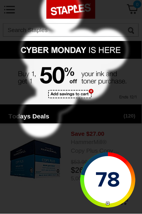
The Framingham, MA giant – which traditionally has a cluttered and distraction-filled website, turned in an impressive mobile performance on Cyber Monday. The eye flow on this one is fantastic. Users see the announcement that Black Friday deals are here. Then they’re guided to a specific offer that rocks, and then users are given the opportunity to view more deals. Meanwhile, the clarity score is a respectable 78.
Like Sears, the Japanese electronics giant has had a tough time lately with brick-and-mortar stores. 20 of 31 US retail locations have been closed – or will be closed – before January 1st. The official reasoning is to streamline costs and focus on existing partner relationships with other retailers. Online, however, Sony looks poised for great results this year – at least judging by the mobile experience. The first thing users see is an announcement that Cyber Monday deals are here, and the design puts up an incredible Clarity Score of 92.

There is no excuse for a top retailer not to have either a responsive website or to redirect users to a dedicated mobile site. But Macy’s, the retail giant founded in 1858, sends users to a scaled-down version of the desktop website. Not only does that make it harder to use, but the first impression suffers a lot. The big problem is the miserable clarity score of 31 – which was the worst score we saw amongst the major retailers. Meanwhile, user attention is initially dominated by 2 competing “sale” messages – both telling you to “hurry up”. Ironically, the part of the page that actually tells you WHY you should hurry up (the 15% discount) doesn’t really stand out that much because of a mediocre colour choice (black on red).

People coming to your mobile site on Cyber Monday are looking for deals, and they are moving fast. But what does the Victoria’s Secret site do? Immediately direct user attention towards a hero shot that conveys very little. Meanwhile – despite multiple sale offers -the words Cyber Monday aren’t used anywhere, which leaves the user wondering: “are these deals any better today than a normal day”? To top it off, the page puts up a weak clarity score of 48.

Williams-Sonoma suffers from a mediocre clarity score (51), but the biggest problem is that users arrive on the page and are immediately presented with what looks like an enterprise pricing table rather than a great deal on home furniture. The call to action isn’t visible, either.
The good news is: no matter what happened this year, there’s always room for improvement next year! What do you think of these ratings? Let us know in the comments!


We look at how to leverage predictive eye tracking to improve your Black Friday marketing campaigns.
Read more
In this article, we’ll discuss our data-driven approach to CRO, including fundamental tools and principles that will help to...
Read more
Great SEO brings users to your site. A great UX helps them achieve their goals after they arrive. Too...
Read more