We value your privacy
This website uses cookies to ensure you get the best experience on our website.
 Skip to main content
This website uses cookies to ensure you get the best experience on our website.
By now, most companies of a certain size have made at least one attempt to institutionalize UX. But few have managed to truly make it a fluid part of their everyday design processes.
The problem is that UX is fundamentally about research, and research takes a lot of time and resources. Those of us in the user experience field are always quick to say that it’s well worth the investment, but the simple truth is that most companies still aren’t doing user research on a consistent basis.
A survey by the Nielsen Norman Group explained that as teams try to incorporate UX into an agile development framework, tight deadlines and limited resources mean that user research is often skipped, even though practitioners acknowledge that they should be doing it.
So what happens instead? In some cases, user research is externalized and treated as a separate project apart from design and development. In other cases, it looks more like part of a Waterfall process, where 90% of the research is done up-front before any design, iteration, or development happens.
Neither of those scenarios lead to adequate research, and the result is a sub-optimal experience for users. This also lowers the ROI of UX as a function, preventing organizational buy-in and investment. The cycle continues.
The only way to break it is to make user research work as a functional part of design and development. It can’t significantly delay projects. It can’t break the bank. In other words, UX research needs to scale.
In order for that to happen, our methods need to change. You can’t do a 100-person usability study every time you need to decide on a font size. You can’t hook 50 users up to an eye-tracker every time you need to choose a button color. You can’t use fMRI or EEG to validate every promotional banner that goes on the homepage of your eCommerce website.
Research needs to be leaner. Jakob Nielsen has been saying this since 1989 and has championed the idea of simpler, more practical approaches over the fancy, expensive research that most experts deemed to be the gold standard in usability.
Nielsen dubbed his approach discount usability, and argued that it often gives better results than so-called “deluxe” usability because its methods drive an emphasis on early and rapid iteration with frequent usability input.
What exactly were his methods? In 1989 they were:
These methods still work today, but technological advances have made “practical” usability methods faster, easier, and even more accessible.
Remote user testing has made it much faster and easier to recruit participants. While you still may only need a handful of participants to get useful feedback, you can now work with higher sample sizes if you want to, without having to wait too long for results.
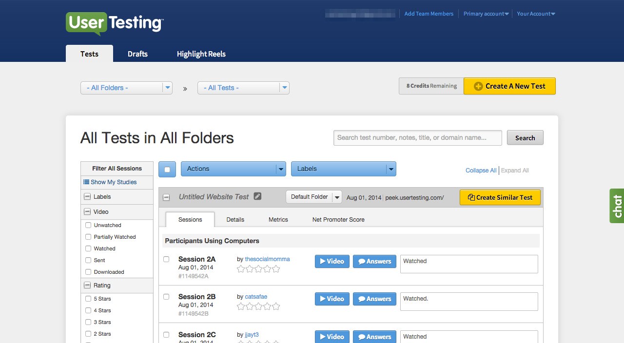
With UserTesting.com or Userlytics, you can draw from a pool of user testers who perform tasks for you online, with no lab or special equipment. Participants tend to be serial testers, and in most cases they’re not actually your customers, but this method is good enough to get meaningful insights. It’s already been embraced by fast-moving companies like Facebook, Airbnb, Intuit, and even Walmart.
Pen and paper are still good! But UX practitioners today have a plethora of fantastic software tools available to make and share prototypes very quickly – even in high fidelity. The purpose of a prototyping tool at this stage is to help you go from idea to dynamic interface as quickly as possible. In other words, speed is the name of the game. Axure is a market leader used by 87% of the Fortune 100, and is particularly well-suited for highly complex interaction designs. But Invision is rapidly becoming the top choice for UX teams today because it’s easier to learn, faster to use, and better for team collaboration.
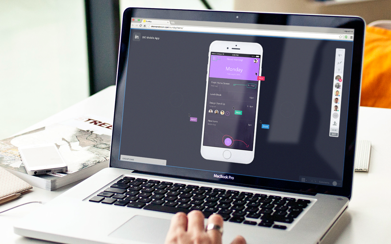
It’s focused on optimizing workflow, and on and team collaboration that integrates well into an agile (or lean) design process. You’ll commonly see not only designers but also product managers, engineers, and QA actively involved in a project through Invision. Also, with a growing variety of integrations available (most notably Sketch), it’s quite possibly the fastest and easiest way for teams to build testable prototypes, iterate from the testing insights, and then rebuild quickly to test again.
According to a case study with LinkedIn, InVision helped their designers increase productivity by 3x.
In the classic sense, a heuristic evaluation is basically an expert review based on best practices and established usability guidelines. It’s not perfect – but it’s better than nothing (which is the default case at most companies). Today, it’s possible to go further than just qualitative best practices.
Instead of solely relying on anecdotal learnings from past research, machine learning has made it possible to inject significantly more objectivity into the process. EyeQuant is the leader in this space. We use hard data from past user research studies to train predictive algorithms that can instantly evaluate the visual hierarchy and clarity of a prototype design and benchmark vs. competitors. You can take prototypes straight from InVision and analyze them with EyeQuant in a matter seconds.

For example, Epson used EyeQuant to establish clear guidelines for when a design is too cluttered. Not only did it confirm the need to redesign several parts of their website, but it also helped validate ideas for new page layouts more quickly and more objectively, leading to double-digit conversion uplifts.
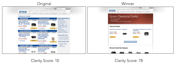
According to Nicolás Celedón, a Conversion Specialist at Google, the value of EyeQuant is in its speed:
“I like EyeQuant a lot because it’s so fast. It’s a scalable approach to UX. I can get insights in seconds that help me define a hypothesis to A/B test, without even putting any tracking code on the website.”
Absolutely. If you have a chance to get participants from your own user base into the lab, you should take that opportunity. The point of this post isn’t to suggest doing less of the more resource-intensive user research. Instead, we want to draw attention to the importance of practical everyday-options to make your research program scale. In terms of budget prioritization, it makes sense to emphasize the practical, everyday methods that facilitate rapid iteration and early testing – just as Jakob Nielsen suggested nearly 30 years ago.


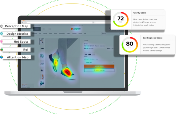
Check out our latest top tips on how you can use EyeQuant to spy on your competitors, analyse mobile...
Read more
In our latest blog we explore how to use neuroscience to help create higher performing digital products.
Read more
Figma is the go-to prototyping platform for many UX and web designers – and not without reason. Its functionality,...
Read more