We value your privacy
This website uses cookies to ensure you get the best experience on our website.
 Skip to main content
This website uses cookies to ensure you get the best experience on our website.

Colour permeates our actions and reactions in every walk of life. It plays into our sense of identity, our...
Read more
We tend to like to think that we are aware of everything going on around us; after all, we...
Read more
As part of a new series on the EyeQuant blog, we turn to our customers and friends to answer...
Read more
“You only have a few seconds to capture someone’s attention.”
Read moreNo more posts to display
No more pages to load
Heat maps: It’s probably the broadest, most popular category of insight tools available to any company that wants to understand and improve the user experience on their website.
They’ve been around for years, and most companies have used them at some time or another. They’re a staple tool for Analytics departments, Conversion Optimization teams, and User Experience professionals everywhere.
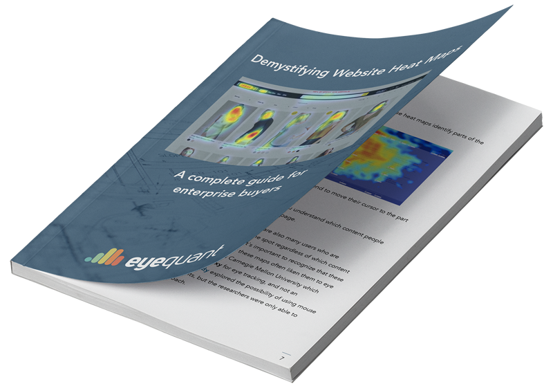

To learn how EyeQuant could improve your design process and increase conversion rates, book some time with one of our specialists.