We value your privacy
This website uses cookies to ensure you get the best experience on our website.
 Skip to main content
This website uses cookies to ensure you get the best experience on our website.
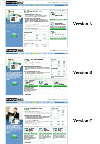
The Conversion Optimization gurus from WiderFunnel, without a doubt one of the most reputed international agencies around, have set up a cool website called ConversionSkills that prompts you to guess the results of A/B-n tests. Here’s an example of 3 landing page variations selling business cards:

The versions differ merely in terms of their layout and design – copy and offers weren’t changed. More importantly, here is the original control version of the website as taken from WiderFunnel’s case study:
Now, one of the three test pages above (A-C) resulted in a conversion rate uplift of over 210% compared to the original version. Which test won?
Clearly, the idea here is that it’s pretty difficult to simply predict which of these versions worked better. That’s the whole point of A/B testing and conversion optimization – why guess when you can measure things?
That said, time is money and the number of possible tests is pretty much unlimited – and since you can’t test everything at once, most successful A/B-n tests typically start with a set of well-informed testing hypotheses that are based on best practices – i. e. what should be tested?
We don’t know if WiderFunnel used eye-tracking studies to generate their hypothesis (it’s a little unlikely, as real studies can be super expensive!). We do however know that we can get very similar results via EyeQuant within seconds, so before we checked out the A/B test results we were curious to see what EyeQuant’s predictions would suggest.
Here is EyeQuant’s Perception Map analysis of the original landing page – what will the majority of users see within the first three seconds?
The result: users are most likely to see the logo, the headline, the business card example images and the banners on the side.
For landing pages, we typically advise customers to try and maximise the initial visibility of three things:
1. What is your offer about? – That’s the piece of copy starting with the headline “Business Cards”. According to EyeQuant, it is visible right away, so people will understand that they came the right place! (Given they’re really looking for business cards.)
2. Why is it cool? – That’s the offer’s value proposition, which in this case is a bit hidden in the white-on-grey low contrast copy…definitely test-worthy to make this more visible!
3. Where do I sign up? – The offer’s Call to Action. Not visible at all – possibly providing the biggest leverage for optimization. Note how the 24/7 customer support and the 50% off on photobooks is stealing the CTA’s show! Classic.
So we’ve identified the invisible Call to Action as the #1 optimization lever.
Let’s look at the EyeQuant results for WiderFunnel’s 3 optimized versions that they tested against each other and the original version:
Firstly, WiderFunnel made sure to combine the What (1) and Why (2) of the offer in one clearly visible, compelling headline (“Get 100 Value Business Cards”) in all 3 versions. This is very often a really good idea, as you’re communicating both immediately in a very quick and effective way. The same goes for reducing the amount of distractions (e. g. special offers for photobooks when you’re currently selling business cards)
If we look at the visibility of the Call to Action elements, only B and C succeed in guiding users’ gaze towards them.
Hence, EyeQuant’s money is clearly on either B or C. Note that these two only differ in the image that is shown, even though this doesn’t make a big difference on how users look at them.
As it turns out, the true winner of this test is version B, yielding a whopping 210% uplift in conversions.
Now, even though EyeQuant’s results obviously cannot fully predict the winner of an A/B test, they confirmed several important issues with the original version and quickly ruled out test version A (albeit it we’re pretty sure it did provide a higher conversion than the original) – all whilst providing results within seconds.
If you’re curious to take a quick free test of your own website, head over to EyeQuant and get your full results in a snap. We’re pretty sure you might just find the next testing hypothesis for your own website.


We look at how to leverage predictive eye tracking to improve your Black Friday marketing campaigns.
Read more
In this article, we’ll discuss our data-driven approach to CRO, including fundamental tools and principles that will help to...
Read more
Great SEO brings users to your site. A great UX helps them achieve their goals after they arrive. Too...
Read more