We value your privacy
This website uses cookies to ensure you get the best experience on our website.
 Skip to main content
This website uses cookies to ensure you get the best experience on our website.

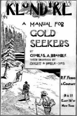
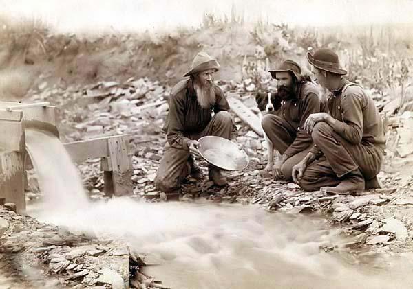
Vying for user attention is a little like panning for gold. Let’s time travel back to 1899: It’s the Klondike gold rush. You’ve climbed the treacherous mountain pass and staked your claim. Now all that’s left is you, the river, and some rudimentary gold panning paraphernalia: a sieve (AKA a classifier) and a metal pan. At first, your limited know-how comes only from a dog-eared manual. Your technique is clumsy to say the least, and as water rushes past, you stand at the soggy riverside for hours, sifting your way through silt to no avail.
Clunky rocks and debris are easily spotted and tossed back into the river, but when you get down to the last layer of silt in your pan, things begin to get interesting – and stressful. A yellowy glint catches your eye, but falls out of the pan and is washed away. Another surfaces, but upon closer inspection you understand that it’s pyrite – fool’s gold! And then, little by little, an unmistakable yellow glow appears amongst the muck, and you shout the tell-tale prospector’s exclamation: “Eureka!”
The burly world of web searches, in many ways, can be likened to the Gold Rush of the late 19th century, when thousands of fortune-seekers flocked to the Klondike (ie. the Internet) in search of the elusive precious metal. After the brunt of spam and misinformation is automatically tossed aside, users trust Google as their pan to wash aside the mud and point them to what they’re looking for. The problem is, a relevant website doesn’t always stand out amongst the pebbles and the pyrite, which is why it’s important to make sure users can tell the difference between Fool’s Gold and the Real Thing before they throw it back into the river.
Probably the most effective way to ensure this is by correctly optimizing your landing page. If a user can identify the 3 W’s – What the website is about, Why they should care (the value proposition), and Where they should go next (the call-to-action) – then a website can expect significantly higher conversion rates and far less bounce traffic.
When testing your landing page with EyeQuant, it is essential to identify these three ‘regions of interest’ in your analysis criteria. For example, if your logo is enormous but nobody can figure out what it is that you do, then adjusting its size in relation to a short description of your offer can significantly improve the results of your ‘What’ region of interest – and a user’s focus. Meanwhile, if your CTA is buried under graphics and less relevant offers, then it’s time to make this crucial element pop by giving it space and adjusting its luminance contrast.

Just like gold panning, web development is a skill that must be honed, and intuition alone cannot not guarantee a jackpot. Luckily for your website, it is neither as dangerous (there are no bears in cyberspace) nor as much of a shot-in-the-dark as looking for gold. When optimising a landing page to draw user attention, frequent analysis of even minor changes is essential. Even with the help of A/B testing and click-tracking, though, it can seem like an impossible hurdle to predict how a user will view your landing page before big or small changes have been publicly launched. Thankfully, there’s no need to rely on the cowboy with “all the answers” in a shadowy corner of a boom-town saloon; EyeQuant’s data-driven approach predicts user viewing attention with over 90% accuracy when compared to an actual eye-tracking study.
Image Credits (all Creative Commons):
http://popsych.org/wp-content/uploads/2012/11/GoldPanning.jpg
http://bioscopic.files.wordpress.com/2010/12/chaplin_goldrush.jpg?w=550
http://digitalstorytips.wikispaces.com/file/view/gold-nugget.jpg/264928378/223×187/gold-nugget.jpg
