We value your privacy
This website uses cookies to ensure you get the best experience on our website.
 Skip to main content
This website uses cookies to ensure you get the best experience on our website.
A building and a website aren’t so different, really. Someone had to design it, and many more people have to use it. In this post, we’ll look at 4 ways to work with UX experts, rein in design ego, and build a website that’s made for change.

In the late 1990’s, author (and founder of that pre-internet wonder, the Whole Earth Catalogue) Stewart Brand wrote and starred in a documentary series for the BBC called How Buildings Learn. In the series, Brand looks at some of the most iconic examples of western architecture, and comes to a few simple conclusions:
Sound familiar? How Buildings Learn comes as highly recommended watching for online marketers, web designers, developers, UX, and usability pros. If you close your eyes, you can almost imagine that the BBC has created a series entirely dedicated to website optimization.
Humans are fallible beings. Inevitably, everything we do will have its share of bugs. The key is to anticipate them, and to be prepared to fix them when they arrive (preferably before your users are left stranded).
In How Buildings Learn, Brand points his attention early on to MIT’s Media Lab, built by acclaimed architect I.M. Pei. As soon as its doors opened to researchers in 1985, the building began to encounter formidable problems: an elevator caught fire, the revolving door repeatedly jammed, and, from Brand’s own experience, “an unfaceable stench of something horribly dead filled the public lecture hall for months.”
Solemnly, Brand notes that, “. . . this is normal”.
Buildings often hire surveyors (optimization translation: UX/Usability experts) to find out what the people use the building think about its conditions. Just like in web optimization, though, this often happens too little, too late. A surveyor interviewed for How Buildings Learn provides this unsettling statistic: “Only 1 in 10 buildings have been revisited by the architect after they’ve been in occupation. It begs the question: how can we know how people react to detailed design features if we don’t revisit the scene of the crime?”

Before a building is opened to the public, vast inspections and use tests are ran. Pre-testing a website before launching is an excellent way to get a sense of needed technical and design modifications before you find out the hard way. There are a number of ways to test design flaws, but a combination of subjective (Usability/UX consultation) and objective (predictive eye-tracking analysis to measure whether your users’ visual attention will flow to the right places) will serve to alleviate the often unanticipated costs and time of post-launch tweaks.

While pre-testing a website’s design before it launches can save valuable time and money, iteratively improving your site once it’s live is another story. Many site owners avoid testing solely for fear of the time and effort it will take to implement the results.

Building a website with a view to eventual changes from the beginning is the key to alleviating future headaches. In How Buildings Learn, Brand speaks of the Palazzo Pubblico in Siena as an enduring example of successful architecture; revised and adapted to contemporary use over 700 years, this building remains relevant – and beautiful – because it has been built to accommodate constant modifications.
We often speak about how to find what to change about a website’s design, but rarely talk about building a website that is built for change. You may have done predictive attention analyses, click-tracking, UX consulting, and user surveys; you may have taken this information and formulated some brilliant A/B testing hypotheses then performed the tests and got the results; but excuses and problems often arrive when the reality of implementation sets in.
To solve this problem, a practical, adaptable, and powerful CMS is needed – one in which content and design modifications can be implemented frequently. Here are few content management systems we would like to give shout-outs to for doing a great job of this:
Despite the massive influence of UX over web design in recent years, it never ceases to amaze us how few landing pages actually take their users into account. Rather, other befuddling aspects tend to creep in; boardroom compromise overtakes actionable goals.
There’s a strange looping effect that exists between more opaque, design-driven websites, and more aggressive, conversion-driven sites, the two poles of web design: at a certain point, they both seem to forget that users are just people trying to complete a task. While subjectivity in any optimization process is inevitable (and lends to brilliant ideas), the end-result often neglects the user in favour of the idea. Designing solely with data, meanwhile, can stifle the design process, and create endless contradictions. The best solution, it seems, is to promote creative decisions, but test them to see what works with users best.
An ongoing theme in How Buildings Learn is a wariness of the architect’s ego. Brand notes, “the renowned French architect Le Corbusier once argued that people should adapt their lives to suit his modernist buildings”. Most of us spend the majority of our lives in a handful of buildings, yet on any given day, we move through possibly dozens of websites. At each moment, our knowledge of how to navigate them, how to interact with them, and how to get what we need from them must adapt to the forms given by the sites’ designers and developers.
As Stewart Brand says, when a building doesn’t work, owners have three choices: “Put up with it, try to change it, or…”

Kaboom – blow up the whole thing and start from scratch.
Luckily, web optimizers don’t have to cough through dust clouds when we want to start from scratch.
An overlooked way to try out new design formats is to build dedicated and PPC landing pages. Think of them like garden sheds and garages – places to hold useful yet pointed content. The undisputed champion of PPC landing page building is (but of course) Unbounce, where their easy-to-use templates and drag-and-drop editors allow you to build and optimize a landing page in less than a day – with no need for I.T. support.
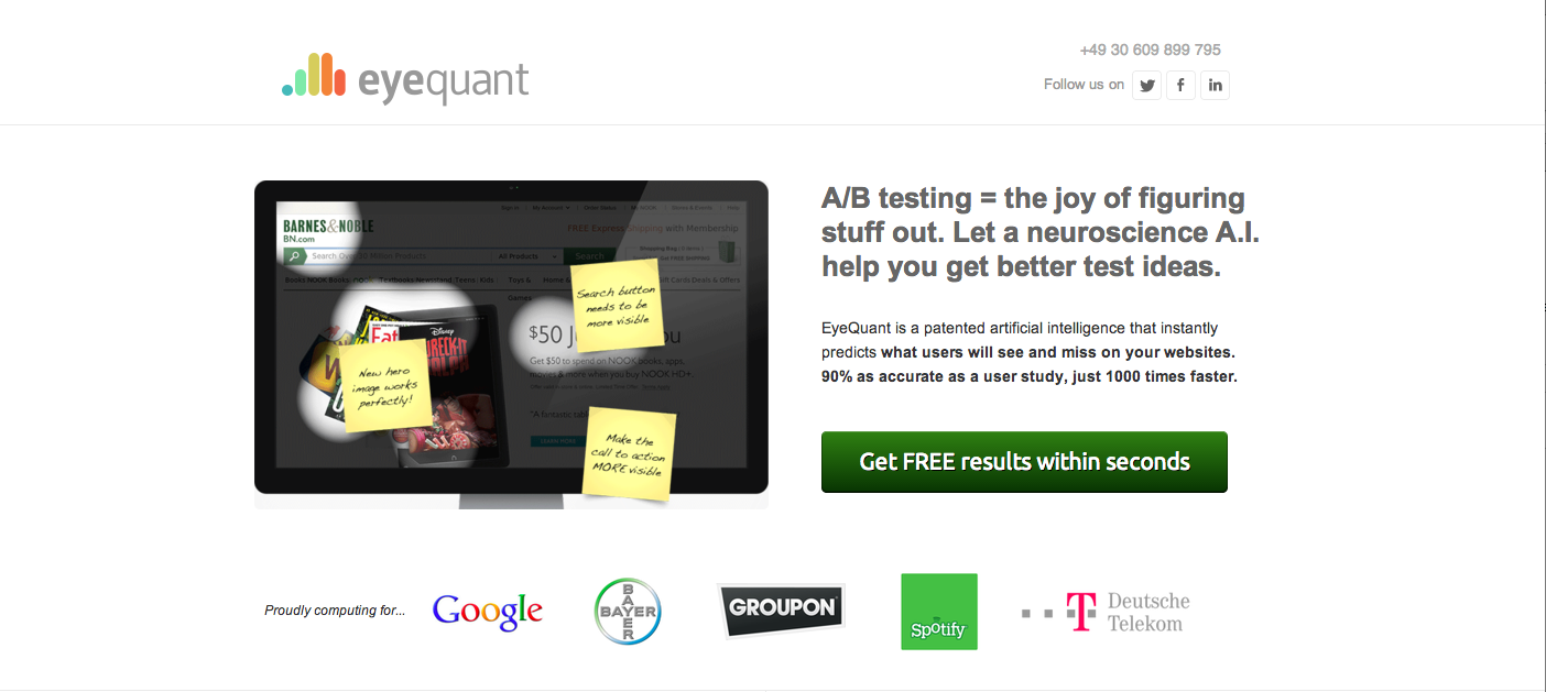
Here’s an example of an EyeQuant PPC landing page, developed using Unbounce:

When a building is commissioned, organizations often choose an architect for their creative flare as opposed to their reputation in creating user-friendly, adaptable spaces. Unfortunately, the same occurs in web design; designers and data analysts are often pitted against each other, and as a result, their positions are polarized – as opposed to harmonized. Ultimately, the loser of this battle of strategies is the user. Whether it’s a building, a toaster, or a web page, design is universal.
While there’s always room for trailblazers and pioneers, innovation comes most steadfastly from iteration as opposed to ego.


Check out our latest top tips on how you can use EyeQuant to spy on your competitors, analyse mobile...
Read more
In our latest blog we explore how to use neuroscience to help create higher performing digital products.
Read more
Figma is the go-to prototyping platform for many UX and web designers – and not without reason. Its functionality,...
Read more