We value your privacy
This website uses cookies to ensure you get the best experience on our website.
 Skip to main content
This website uses cookies to ensure you get the best experience on our website.
Booking.com has a reputation for being one of the most heavily A/B-tested websites on the internet. Every feature, every font size and every color choice has been put to the test at some point. It’s one of the reasons that Booking has been so successful in an incredibly competitive travel booking space.
But after years of optimization efforts and thousands of A/B tests, this is what the Booking.com home page looks like:
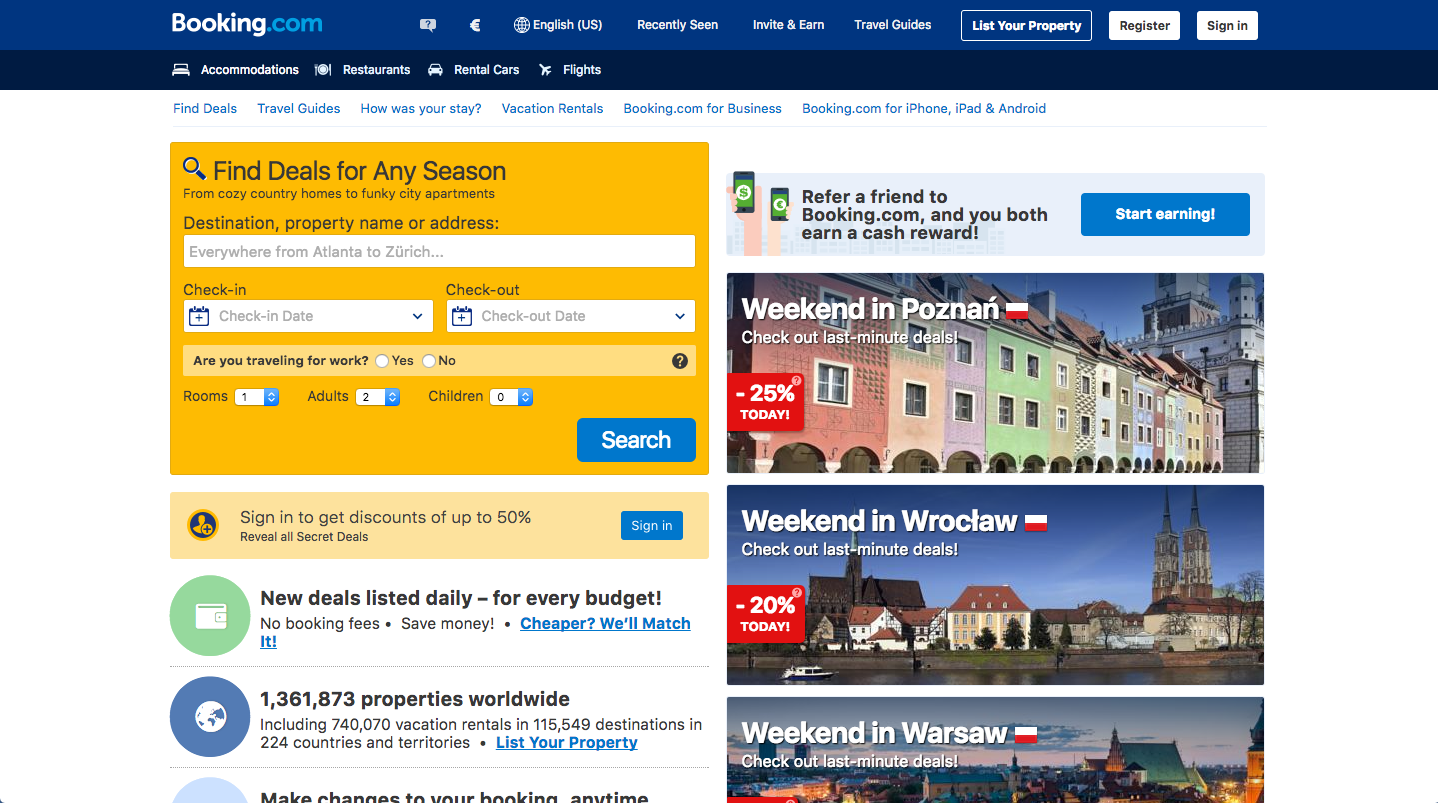
Is this really what the optimal travel booking website looks like? Is this what other players in the space should strive for?
It’s cluttered. To confirm this, we analyzed 28 travel booking websites with EyeQuant’s Visual Clarity algorithm, which assigns a 0-100 score to web designs. Lower scores indicate cluttered designs, and higher scores indicated cleaner, clearer interfaces. The algorithm was trained with real user research data from hundreds of websites, and is 90% as accurate as a 200-participant study.
Booking.com scores a 32, lagging far behind the industry average of 71, proving that Booking’s homepage is objectively much more cluttered than most other travel sites.
It’s full of visual distractors. To evaluate this, we used EyeQuant’s visual attention model, which predicts which content will initially be most/least eye-catching, and is trained with data from eye-tracking studies. Results are 85% as accurate as a real eye-tracking study. It turns out, the personalized ads for specific destinations are more eye-catching than the search widget itself.
In this case, “Poznan” is the most visible word on the page. This destination has been chosen for me because I booked a hotel in Poznan 3 months ago. But for my next trip, I actually want to go to Vancouver. Yet the design of the page is actively directing my attention to a destination that’s no longer relevant for me.
Booking has so much traffic that they’re able to isolate even the smallest variable to measure its impact. So that’s what they do – they run small, isolated tests on every imaginable piece of the website. This makes sense because by isolating individual variables (an image choice, a font color), it’s possible to measure the impact of each individual element of the website.
If you completely re-design the home page, for example, you wouldn’t be able to do this. You’d see a shift in overall conversion rates, but you wouldn’t know which variables drove that change. Was it the increase in font size? The addition of a sub-header? The removal of unnecessary banners? They wouldn’t be able to tell.
There’s a problem though with relying so heavily on small, isolated iterations: the scope of your tests will be very narrow, and if you run a lot of tests like Booking does, you’ll eventually reach a point where it’s difficult to generate uplifts through small tweaks. This happens as you approach a Local Maximum in conversion rates.
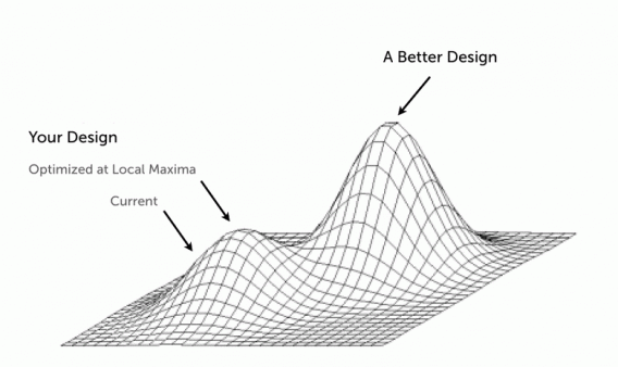
According to Alex Birkett from ConversionXL, a local maximum in the context of conversion optimization is:
When you hit the peak of your current design. It can’t get much better – even if you make a thousand small tweaks, you can only improve so much. The site is as effective as it ever will be on its current structural foundation.
In order to move from a local maximum to a global one, your CRO program needs to include not just iterative tests, but also a series of bigger, bolder tests as well.
Paul Rouke from PRWD suggests that to reach their full potential, A/B testing programs need to leverage both iterative testing (small tweaks) and innovative testing (bolder changes).
This might explain why Booking.com, Amazon and other sites that perform a lot of A/B tests look the way they do. It’s not because they’ve reached the “optimal design”, it’s because they’ve focused primarily on getting the most out of their current design. Indeed, the Booking.com home page hasn’t changed that drastically from 10 years ago:

It’s certainly been updated and features have been added, but it looks largely the same in terms of its overall design. That’s not necessarily a bad thing, but at some point these sites will need to employ innovative testing approaches to break through a plateau in conversion rates.
Just for fun, our team decided to try our hand at re-designing the Booking.com homepage, using EyeQuant to guide us through the process and help us decide what’s likely to work, and what isn’t. Note: this is just a very, very rough mockup for the sake of example only, but here’s what we came up with:
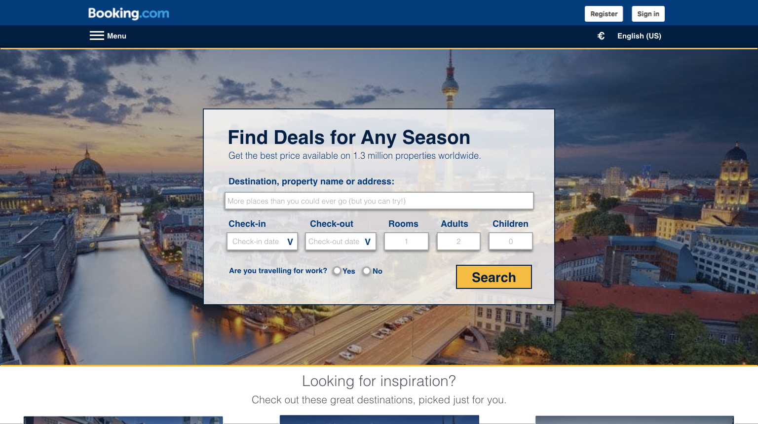
Here are some of the changes:
1. Instead of having several distracting images on the page, this design sticks 1 one main image that blends into the background. This image can be personalized based on a user’s search history or popular locations. In this case I’ve used a shot of Berlin (image source).
2. The color scheme within the search widget allows for a high level of luminance contrast, which ensures that the most important content gets noticed first. This also improves accessibility.
3. The current version of Booking.com has plenty of extra links, offers, and options which are only relevant to a specific sub-set of visitors. The design above has a “menu” section in the header where some of these options can be presented.
The EyeQuant results for this design show a laser-focus on the most important content:

Users immediately see what the site is about, why they should use it, and where to go next. There are also recommended destinations that are easy to find for those looking for inspiration, but not annoying or disruptive for people who know exactly where they want to go.
The biggest improvement, however, comes in the reduction of clutter on the page. This design scores an 84/100 on our visual clarity index, triple the score of Booking’s actual design. It also scores better than Priceline‘s homepage, and isn’t too far behind SkyScanner. According to EyeQuant, this design would also be more exciting than the existing Booking homepage (80 vs. 64).
That’s not to say this design is the right one – again, it’s only a quick mockup to serve as an example of the type of approach Booking could take if they were to embrace innovative testing in addition to the iterative testing they’re already doing.
The main take-away here is that Iterative vs. Innovative testing shouldn’t be an either-or decision. We mentioned earlier in this post that radical re-designs have a major drawback: it’s very hard to unpack the changes you’ve made and figure out which of them actually drove an uplift (or drop) in conversion rates. But that’s something you figure out using iterative tests! Indeed, one CRO approach that could work very well is to run iterative tests until you hit a plateau in conversion rates, then run a series of bolder tests (such as radical redesigns). Afterwards, you can go back to another series of iterative tests to measure the impact of specific components of the new design. It’s the best of both worlds.
—


We look at how to leverage predictive eye tracking to improve your Black Friday marketing campaigns.
Read more
In this article, we’ll discuss our data-driven approach to CRO, including fundamental tools and principles that will help to...
Read more
Great SEO brings users to your site. A great UX helps them achieve their goals after they arrive. Too...
Read more