We value your privacy
This website uses cookies to ensure you get the best experience on our website.
 Skip to main content
This website uses cookies to ensure you get the best experience on our website.
The user experience starts way before anything is read or clicked. It only takes 50ms for users to form a first impression of your website. These are gut reactions that are emotional at heart and result from the way your site is designed. It can lead users to be excited, calmed, or even bored right as they land on the page. This is why it’s important to make sure that your design evokes emotions that match your product or service.
For instance, an insurance company might want to convey trustworthiness via a more conversative site. Or a site that sells children’s books may want to be less conservative and more playful. We can see an example of this with Wonderbly’s design:
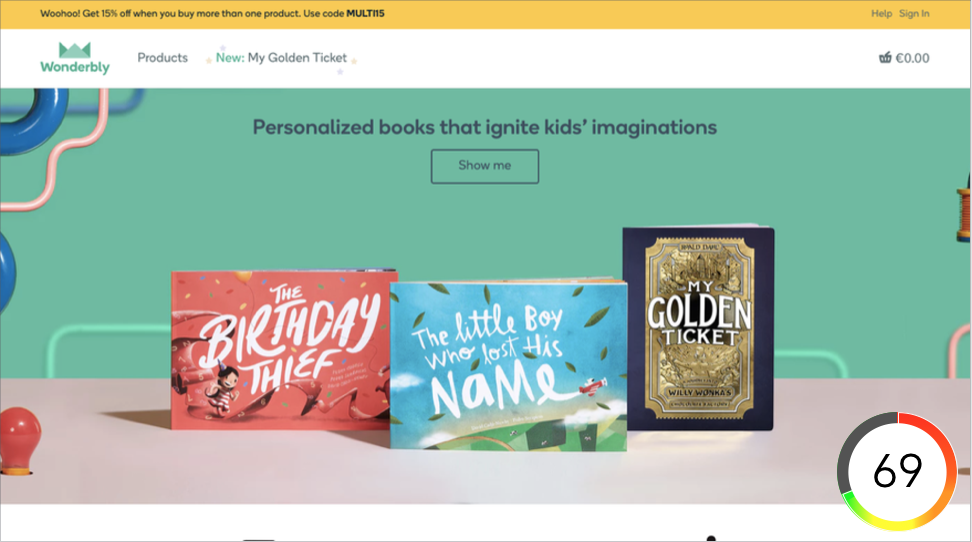 Wonderbly’s design was rated with an excitingness score of 69/100 by EyeQuant’s excitingness algorithm. It’s based on large amounts of user research data and predicts how exciting, calming or boring a design will appear to users.
Their design matches the mood users will be in when looking for this particular kind of product – it’s perfect for new parents that want to get their child a new book that they’ll enjoy. This is not a coincidence, Wonderbly chose their imagery carefully to accomplish the emotional response it gives to ultimately drive their site’s performance. Put simply, it’s good for business to evoke the emotional responses users are expecting when looking for a certain type of product or service. It literally affects how users experience your site. How can we then effectively create the desired emotional response?
Designing for emotions isn’t a new topic in the online world. In 2005, Dan Norman published his book Emotional Design and introduced the idea that there are three levels of visual design to evoke emotions in consumers/users. The three levels are:
The visceral level describes our automatic emotional response to something we see. This reaction is a result of how we’re wired and is out of our control. It’s the first impression we get when landing on a page and we can’t help ourselves but feel more excited, calmed or bored. This is the first step to consider when designing for emotions.
Most UX practices focus on the behavioral level since it’s all about functionality and usability. A website which is easy to navigate, has a clear visual hierarchy and is all together easy to use, will generally give users a more positive emotional reaction. On the flip side, if users need to expend excess mental effort to find what they’re looking for, expect frustration and impatience. Any brand should try to avoid this at all costs.
As the heading suggests, this is where we take a step back and reflect upon the entire experience we’ve had with a brand’s website. This can have a huge impact on whether a user becomes a loyal customer or just paid a visit. Although it may be the least immediate and takes the most time to form, it’s just as important to consider.
Each of the levels of visual design plays a key role in creating an emotional response that fits your brand’s image. However, it is important to keep the temporal order of these levels in mind.

For instance, the first level visitors will go through is the visceral level. This makes the visceral level significant since it has a tremendous impact on the rest of a user’s journey. It anchors them to an emotional state. As mentioned above, this happens at an incredibly fast rate; it only takes 50ms (or even 17ms according to Google) for users to form that crucial first impression of your site. First impressions are a gut reaction to visual features, a direct result of how our brains and visual systems have evolved. It’s imperative that designers get it right and test what kind of an emotional impact a visual design has on their users.
What happens if the emotional response changes and doesn’t meet users’ expectations anymore? Take Dropbox for example who just launched their largest rebranding campaign in 10 years. Their goal was to ultimately stand out more amongst other cloud storage providers by making their brand more expressive and playful. To do this they gave their design a different “feel” to change the emotional response users get when landing on their page.
What’s interesting is that these changes mainly address the visceral level. For example, their actual product’s design has largely remained the same (where changes would heavily impact the behavioral and reflective levels). Although it’s a matter of taste whether one likes the new design or not, they’ve certainly hit the mark in terms of making their site more exciting. Here’s a side by side comparison of the old and new design, alongside Excitingness scores from EyeQuant:

The scores show that Dropbox has, in fact, increased its excitingness score. This suggests that they’ve considerably changed the manner users will emotionally respond to their page. It certainly departs from their previous brand image that centered around a calm, focussed design. As a result of this, there’s a mismatch between what users expect of Dropbox and what they actually encounter. This has led to a surge of responses from the community:


Yes, change takes time, but it’s very likely that many users are having similar experiences at the moment (and in the future). There’s a clear disconnect from what they think Dropbox is, and how they present themselves now after the redesign. For new users, this could then lead to a diminished feeling of trust and impact Dropbox’s bottom line, as this is one of the features users value most.
Key takeaways
In this session, we explored how teams can move beyond instinct and start making creative decisions based on how...
Read more
What does attention prediction actually look like in day-to-day design work? In this month’s webinar, we’re joined by leading...
Read more
The way teams predict attention is changing fast — and so are the tools that make it possible. In our...
Read more