We value your privacy
This website uses cookies to ensure you get the best experience on our website.
 Skip to main content
This website uses cookies to ensure you get the best experience on our website.

Big Rock used EyeQuant to increase website conversion rates by 27%
Finding and winning new clients, delivering impressive results, whilst retaining and inspiring employees means that Big Rock is always looking for the very best tools and training to add even greater value to its clients and employees.
When Big Rock first audited the EyeQuant website it was clear that although the EyeQuant product enables hundreds of marketing, product and UX professionals to optimise website designs, there was serious room for improvement on its own website. Not only was EyeQuants website not performing as well as it should be from a technical perspective but the value proposition was outdated and did not reflect the full capability of the tool.
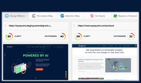


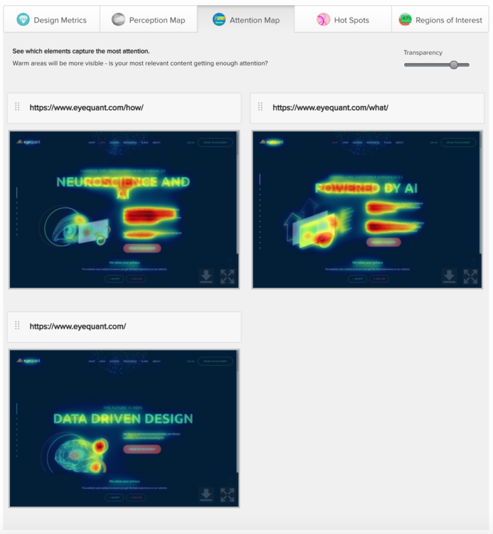
During the ideation phase of the website build, Big Rock used the compare functionality within EyeQuant to benchmark which design variants achieved the design goals i.e to capture attention within the first 3-5 seconds of a website visitor landing on the page. The screenshot to the right shows the evolution of the design process and how Big Rock’s design team used design metrics to identify which components contribute to the better performing design.
The design team at Big Rock were able to objectively measure how clean and uncluttered the new designs were. As the tool can analyse design files as well as live URLs, the team also compared the new designs against competitors to ensure the new designs were better at capturing attention than the old designs and competitor designs. The clarity score improved by 17 points and the level of visual stimulation increased by 8 points.
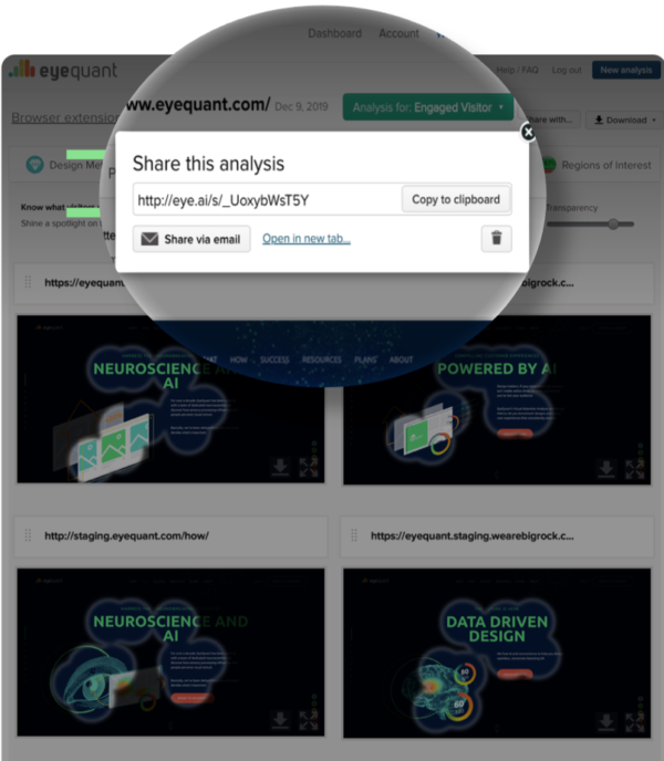
To speed up the sign-off process and reduce the number of amends created, Big Rock used the share functionality in EyeQuant to instantly produce a public link that enabled the marketing team to review up to 6 design variants side-by-side.
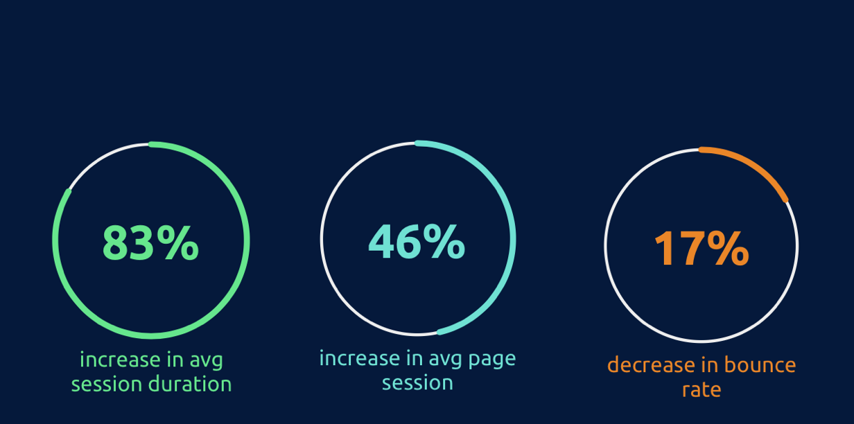
With EyeQuant’s Regions of Interest tool, Big Rock designers measured how eye-catching certain areas were between design iterations to ensure the final version was destined for conversion success. As you can see from the screenshot below, we used the compare function to highlight key areas of the new and old website designs. After a two week period, the performance of the website has increased by:
To learn how EyeQuant could improve your design process and increase conversion rates, book some time with one of our specialists.