We value your privacy
This website uses cookies to ensure you get the best experience on our website.
 Skip to main content
This website uses cookies to ensure you get the best experience on our website.
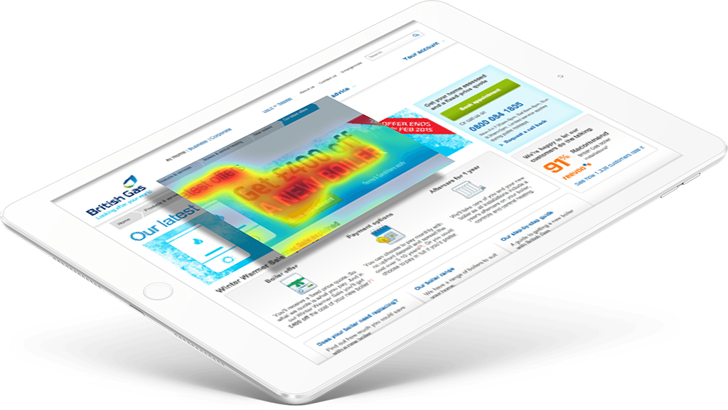
How British Gas earned more leads with clean, focused landing page design.
Every month, tens of thousands of people across Britain land on this page in search of a great deal on a new boiler. For the digital optimisation team, it’s critical to maximise conversion rates on this page because clicks translate into revenue.
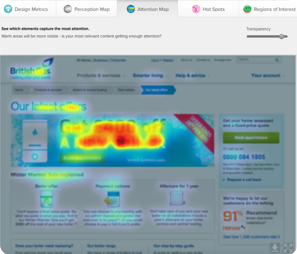
An EyeQuant analysis uncovered a couple conversion-killers on the landing page.
The £400 offer overshadowed key information like:
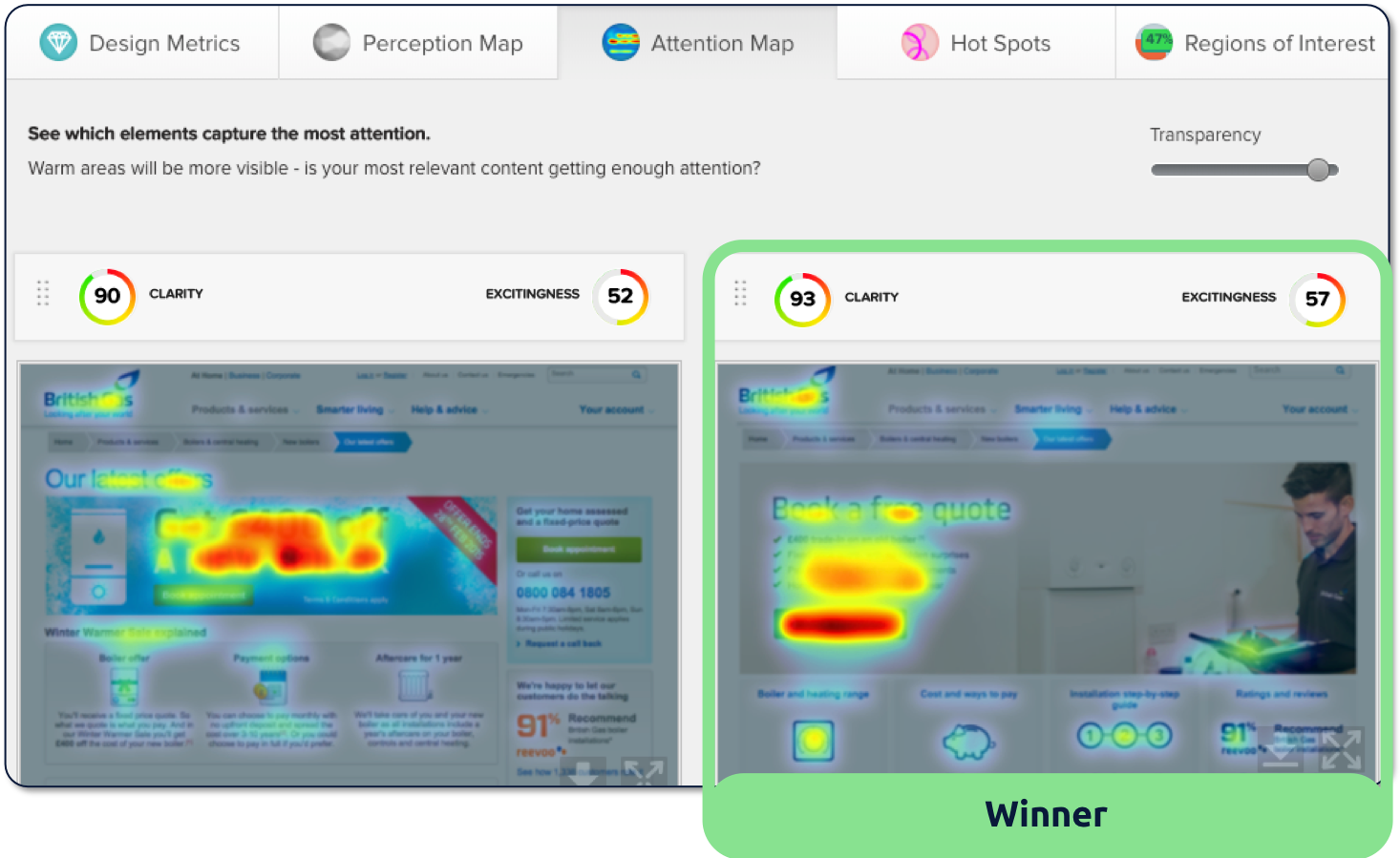
The Digital Optimisation Teams, Digital Experience Managers and Designers use EyeQuant regularly to start coming up with new design hypotheses and test mock-ups by uploading the design files into EyeQuant to get immediate objective feedback.
The final variants that were deemed worthy of seeing live traffic had 3 things in common:
The team at British Gas continue to use EyeQuant alongside tools including Maxymiser and Adobe analytics to identify the pinch points in customer journeys. They use the instant insights from EyeQuant to improve variations before launching A/B tests via Maxymiser.
Now that the most important information will be seen immediately, British Gas A/ B tested the new variant and achieved a 50% uplift in conversions



To learn how EyeQuant could improve your design process and increase conversion rates, book some time with one of our specialists.