We value your privacy
This website uses cookies to ensure you get the best experience on our website.
 Skip to main content
This website uses cookies to ensure you get the best experience on our website.
1. “Less is more”
It has been statically proven, the more clutter on a page, the higher the bounce rate. From a neurobiological perspective, cluttered designs lack visual order, thus increasing cognitive load as users struggle to navigate the visual landscape and understand which parts are important. So, less is more, right? Well, not quite. Take a look at the below examples, on the left we have a page with a clarity score of 65. By comparison to the page on the right, it’s a relatively clutter-free page because:
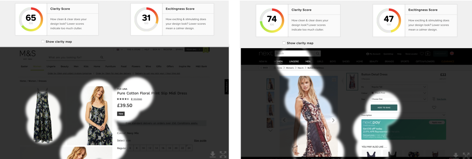
HOWEVER, whilst the design on the left is less cluttered than the design on the right (for the reasons stated above), clarity isn’t the only design metric that translates into a more positive user experience. Emotion plays a pivotal role in designing a positive user experience. Emotional Design by Dan Norman is one of the best books to help introduce the concept of emotional design, outlining three levels of visual design:
2. “User feedback is gospel”
Maybe it’s because gathering user feedback requires a huge amount of time and budget, that we can often make the mistake of hanging off every word that is said (or mouse that’s clicked). Don’t get me wrong, usability testing remains the best way to understand how real users experience your website or app. But waiting until you’re at stage 5 (on the image below) before you obtain critical user feedback and data means that you’re potentially lengthening development cycles and adding more than a few ££ onto your project.
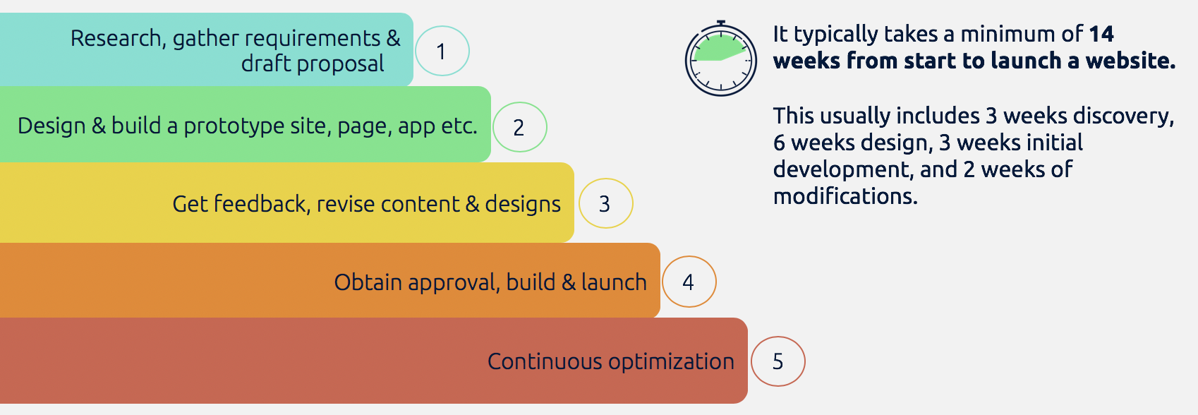
By incorporating user feedback and data earlier on in the development process, say at stage 2, when you’re designing prototypes, you significantly reduce the number of variants you go test in live conditions. But how do you gather data on how users will perceive and engage with your designs before pushing your design live? Well, the perfect combination of AI and neuroscience enables you to predict, with 85%-90% accuracy, how users will respond to your prototype.
3. “Rotating Banners are a great way to promote your latest products or content”
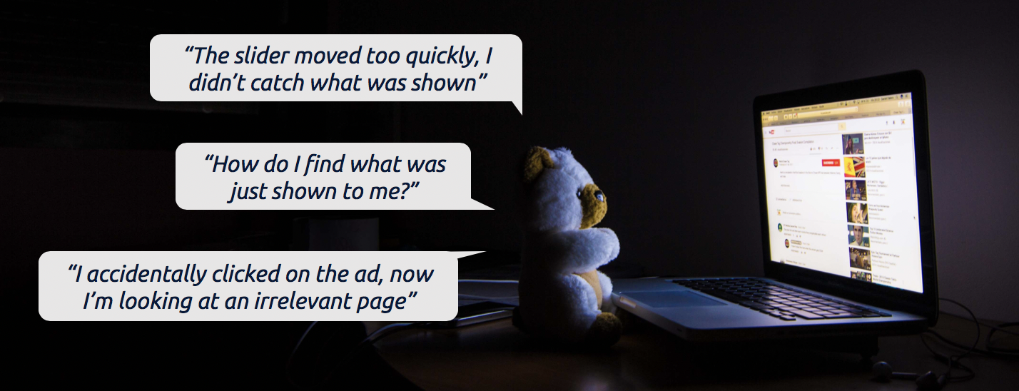
There was a time when rotating banners (or carousels, if you prefer) were all the rage. They were like flared jeans, everybody had a pair at one point. Digital marketers and web designers loved rotating banners because they allowed multiple pieces of content (which, by the way, are all CTA’s fighting for limited attention) to occupy the most prominent space on a web page, usually the homepage. But research by uxstudio shows that users actually get frustrated waiting to be served the next piece of content and those rotating banners actually interfere with a regular user journey. Unless you’re a publisher, it’s very unlikely that a user has visited your website to sit there, on your homepage, consuming information. Users generally have a specific reason or goal (like shopping for a particular pair of flared jeans or looking for contact information) for visiting your site, and most of the time your rotating banner just gets in the way of them completing their goal. This leads to poor customer experience. Not to mention, due to the size of the banner, it often increases website load speed, which is not good if you consider you are losing 7% of visitors for a 1-second delay in page load.
4. “The more people you involve in the design process the better the outcome”
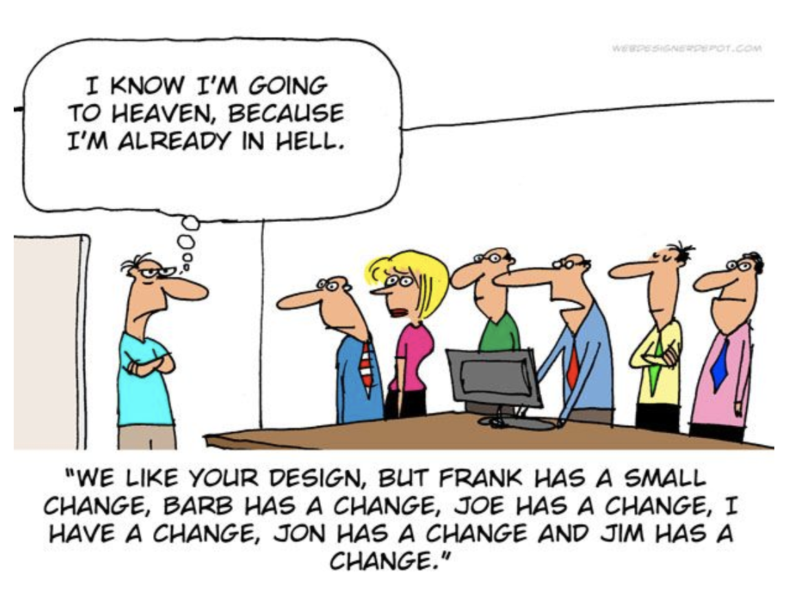
There’s safety in numbers, right? Wrong. It’s every designer’s worst nightmare: design by committee. I think the award-winning cartoonist, Jerry King, accurately captured the struggle every designer faces in the cartoon below:
5. “Engage users with stock photography”
Due to the proliferation of sites like Shutterstock and Freepick, stock imagery has become so commonplace that it’s rare to stumble upon a website displaying original photography. There are vast amounts of research evidencing facial expressions captured in photography produce changes in the ANS (Automatic Nervous System) and stimulate brain activity so you’d assume stock photography could help create emotions (which we know is really important during the purchase process). However, a number of websites have an over-reliance on stock imagery and subsequently detract from the goal-orientated journey, as you can see here in this analysis:
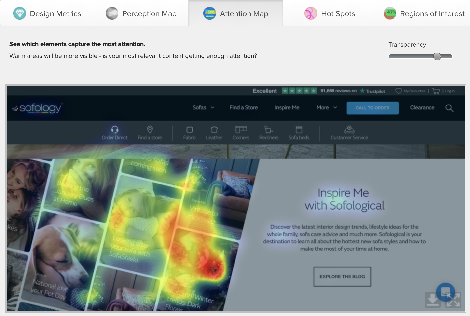
The eye is intuitively drawn to the photos of faces and animals, which could be a good thing if used wisely (especially if you are a digital designer working for a pet store). But unfortunately, most of the time, stock photography is overused and it diverts attention away from the overall page goal, which in the case above is to ‘explore the blog’, but I’m guessing you didn’t see that until I pointed it out. Top Tip: whenever you can, try to use authentic photos you’ve taken yourself and use software like EyeQuant to assess if the images compete for attention with your main CTA.

Check out our latest top tips on how you can use EyeQuant to spy on your competitors, analyse mobile...
Read more
In our latest blog we explore how to use neuroscience to help create higher performing digital products.
Read more
Figma is the go-to prototyping platform for many UX and web designers – and not without reason. Its functionality,...
Read more